# A tibble: 5 × 3
      x y     z
  <int> <chr> <chr>
1     1 a     K
2     2 b     K
3     3 a     L
4     4 a     L
5 5 b K Lab - Prelim review
Lab
Important
There is no explicit lab assignment to turn in for this week.

Learning goals
- Review for exam 01 (the prelim)
Getting started
Go back through your past assignments in the course (application exercises, labs, homeworks, etc.). Identify and specific methods, functions, or concepts that you struggled with or that you would like to review.
Open Q & A
Ask the TAs any conceptual review questions you may have. Ask to review any past assignments, in particular suggested solutions that you may not have fully understood.
Practice problems
Below are some practice problems you may complete in order to prepare for the exam. The suggested solution is hidden below each exercise. Try to solve the problem on your own before looking at the solution.
Interpreting charts
The following chart was shared by @GraphCrimes on Twitter on September 3, 2022.
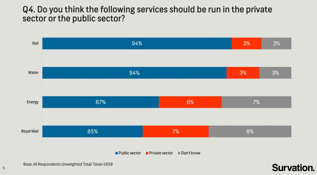
- What is misleading about this graph?
- Suppose you wanted to recreate this plot, with improvements to avoid its misleading pitfalls from part (a). You would obviously need the data from the survey in order to be able to do that. How many observations would this data have? How many variables (at least) should it have, and what should those variables be?
Suggested solution
The bar segments do not visually match the text labels. For example, the “Public Sector” segment for the Royal Mail bar is labeled as 85%, but visually does not fill 85% of the bar.
-
It should have 1858 observations (based on the plot’s caption). It would need to have at least two variables.
- Service (rail, water, energy, or royal mail)
- Preference of who should run the service (public sector, private sector, or don’t know)
All about group_by()
Suppose we have the following data frame:
Answer all questions without actually running the code.
-
What is the difference between these two piped operations?
df |>
  group_by(y)

df |>
  arrange(y)
Suggested solutiondf |> group_by(y)# A tibble: 5 × 3 # Groups: y [2] x y z <int> <chr> <chr> 1 1 a K 2 2 b K 3 3 a L 4 4 a L 5 5 b Kdf |> arrange(y)# A tibble: 5 × 3 x y z <int> <chr> <chr> 1 1 a K 2 3 a L 3 4 a L 4 2 b K 5 5 b KThe first operation groups the data frame by the
ycolumn, while the second operation sorts the data frame by theycolumn. -
What does the following code do?
df |>
  group_by(y, z) |>
  summarize(mean_x = mean(x))
Suggested solutiondf |> group_by(y, z) |> summarize(mean_x = mean(x))`summarise()` has grouped output by 'y'. You can override using the `.groups` argument.# A tibble: 3 × 3 # Groups: y [2] y z mean_x <chr> <chr> <dbl> 1 a K 1 2 a L 3.5 3 b K 3.5This code groups the data frame by the
yandzcolumns, and then calculates the mean of thexcolumn for each group. -
How will the output of this code be different from part (b)?
df |>
  group_by(y, z) |>
  summarize(mean_x = mean(x), .groups = "drop")
Suggested solutiondf |> group_by(y, z) |> summarize(mean_x = mean(x), .groups = "drop")# A tibble: 3 × 3 y z mean_x <chr> <chr> <dbl> 1 a K 1 2 a L 3.5 3 b K 3.5The output will be the same as part (b), but the grouping information will not be retained in the output (i.e. it will be an ungrouped data frame)
Analyzing flight performance of dragons
We have data tracking the flight performance of dragons across 500 trips.1
1 For all you Empryean Series fans out there. Also not real data. Thanks ChatGPT.
Variables include:
Average Wind Speed (mph)
Flight Distance (miles)
-
Dragon Type
- Fire Dragon – Powerful but heavy, struggles in strong winds.
- Ice Dragon – Prefers icy conditions, decent endurance.
- Storm Dragon – Loves turbulent air, flies far in high winds.
- Forest Dragon – Agile but avoids strong winds, moderate endurance.
The data is stored in dragons and looks like this:
# A tibble: 500 × 3
   wind_speed flight_distance dragon_type
        <dbl>           <dbl> <chr>
 1         15              63 Ice Dragon
 2         38              85 Storm Dragon
 3         29              45 Fire Dragon
 4         24              48 Fire Dragon
 5          6              94 Fire Dragon
 6          6             110 Fire Dragon
 7          2              98 Forest Dragon
 8         35              33 Fire Dragon
 9         24              52 Forest Dragon
10         28              41 Forest Dragon
# ℹ 490 more rows
You believe that Storm Dragons will perform better in high winds compared to the other dragon types.
- What kind of visualization would you use to compare the flight distance of Storm Dragons to other dragon types at different wind speeds?
- Write the R code you would use to create this plot.
Suggested solution
I would probably use a color-coded scatterplot with wind speed on the x-axis, flight distance on the y-axis, and different colors for each dragon type. Since there are 500 observations, smoothing lines will probably be useful to summarize the trends.
-
Here is the R code to create this plot:
ggplot(
  data = dragons,
  mapping = aes(x = wind_speed, y = flight_distance, color = dragon_type)
) +
  geom_point() +
  geom_smooth()
Cleaning coffee orders
You are given a dataset that records orders at a coffee shop. It looks like this:
| order_id | drinks |
|---|---|
| 201 | Latte-Medium, Espresso-Small, Mocha-Large |
| 202 | Cappuccino-Small, Latte-Large |
| 203 | Mocha-Medium, Espresso-Large, Latte-Small |
- Explain why this dataset is not tidy according to the principles of tidy data.
- Identify the tidy structure for this data. What information would be stored in rows? What would the columns be?
- Write the R code to convert the original dataset into the tidy structure you identified in part (b).
Suggested solution
The dataset is not tidy because the
drinkscolumn contains multiple values in a single cell. Not only does it contain multiple beverages, each beverage is also paired with a drink size.-
The tidy structure would be
- Each drink is in a separate row.
- Columns include the order ID, the type of drink, and the drink size.
-
Here is the R code to convert the original dataset into the tidy structure:
# original structure
coffee_orders
# A tibble: 3 × 2 order_id drinks <dbl> <chr> 1 201 Latte-Medium, Espresso-Small, Mocha-Large 2 202 Cappuccino-Small, Latte-Large 3 203 Mocha-Medium, Espresso-Large, Latte-Small# tidy structure coffee_orders |> separate_longer_delim( cols = drinks, delim = "," ) |> separate_wider_delim( cols = drinks, delim = "-", names = c("drink", "size") )# A tibble: 8 × 3 order_id drink size <dbl> <chr> <chr> 1 201 "Latte" Medium 2 201 " Espresso" Small 3 201 " Mocha" Large 4 202 "Cappuccino" Small 5 202 " Latte" Large 6 203 "Mocha" Medium 7 203 " Espresso" Large 8 203 " Latte" Small
) ```
Submission
There is nothing to submit for this lab.
Grading
There is no grade for this lab.