Lab 02 - Data wrangling
This lab is due February 10 at 11:59pm.
Learning objectives
- Wrangle data to extract meaning from it
- Practice reproducible workflows for data analysis
- Implement data visualizations
- Utilize automated helpers to assist with code style and best practices
Getting started
Go to the info2951-sp25 organization on GitHub. Click on the repo with the prefix lab-02. It contains the starter documents you need to complete the lab.
Clone the repo and start a new project in RStudio. See the Lab 0 instructions for details on cloning a repo and starting a new R project.
You may complete a lab assignment collaboratively with up to three peers in the class (maximum group size of four). If you choose to do so, please submit the assignment only once in Gradescope. You should also revise the YAML header (the author argument only) in your Quarto document so you can list all the students who worked on the assignment.
author:
  - "Student 1 (netID)"
  - "Student 2 (netID)"
  - "Student 3 (netID)"
- "Student 4 (netID)"As we’ve discussed in lecture, your plots should include an informative title, axes should be labeled with appropriate units indicated (e.g. %, $), and careful consideration should be given to aesthetic choices.
In addition, the code should not exceed the 80 character limit, so that all the code can be read when you render to PDF. To help with this, you can add a vertical line at 80 characters by clicking “Tools” \(\rightarrow\) “Global Options” \(\rightarrow\) “Code” \(\rightarrow\) “Display”, then set “Margin Column” to 80, and click “Apply”.
Remember that continuing to develop a sound workflow for reproducible data analysis is important as you complete the lab and other assignments in this course. There will be periodic reminders in this assignment to remind you to render, commit, and push your changes to GitHub. You should have at least 3 commits with meaningful commit messages by the end of the assignment.
{styler} for code formatting
Using appropriate code style and adhering to a comprehensive style guide can be complicated at times. {styler} is an R package that formats your code according to the {tidyverse} style guide so you can focus your attention on the content of your code. RStudio includes an interactive “Addin” that makes it (mostly) straight-forward to format your code in a Quarto document.
Use {styler} on poorly-formatted code
- Open
ae-00-unvotes.qmdin your repository. Render the document. Does it work successfully? How easy or hard is it to read the code and understand what it does? - Switch RStudio to Source Editor mode using the options in the top-left corner of the code editor panel.
The {styler} RStudio addin will not work when your IDE is in Visual Editor mode. This is a bug in RStudio that is yet to be fixed.
-
Open the command palette (either ctrl + shift + p or cmd + shift + p) and select “Style active file”.
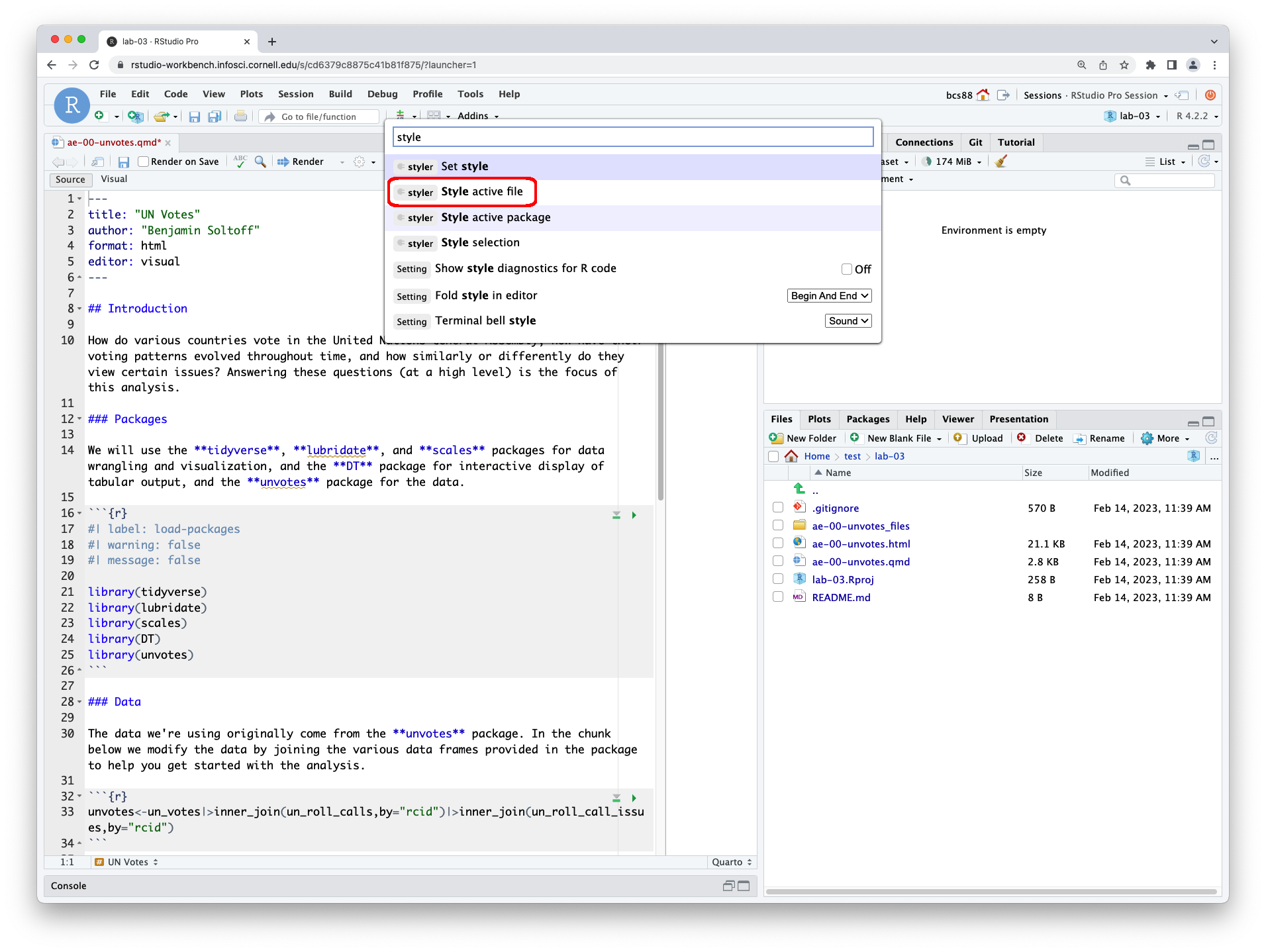
Observe how the code chunks have now been modifed.
The file remains unsaved. Save and render the document. Examine the output. How easy is it to read the code? Did it fix all the problems?
Switch the IDE back to Visual Editor mode (if you prefer it). Fix the remaining issues with the code. Render one more time and check that the code is fully readable in the HTML document.
ae-00-unvotes
You do not need to submit any of the contents of your ae-00-unvotes.html file as part of lab-02 on Gradescope. This is ungraded practice so that you can use {styler} to assist you with writing clean, interpretable code for your other course assignments (and life).
Why immigration is important to scientific progress in the United States
In January 2017, Buzzfeed published an article on why Nobel laureates show immigration is so important for American science. You can read the article here. In the article they show that while most living Nobel laureates in the sciences are based in the US, many of them were born in other countries. This is one reason why scientific leaders say that immigration is vital for progress. In this lab we will work with the data from this article to recreate some of their visualizations as well as explore new questions.
The Buzzfeed article was originally published in 2017. The dataset for our analysis is updated as of the 2024 Nobel awards. There may be minor differences from the original article based on new recipients as well as those whom have died since 2017. Think of this as a replication and extension.
Packages
We’ll use the {tidyverse} package for much of the data wrangling.
Data
The dataset for this assignment can be found as a CSV (comma separated values) file in the data folder of your repository. You can read it in using the following.
nobel <- read_csv("data/nobel.csv")The descriptions of the variables are as follows:
-
id: ID number -
firstname: First name of laureate -
surname: Surname -
year: Year prize won -
category: Category of prize -
affiliation: Affiliation of laureate -
city: City of laureate in prize year -
country: Country of laureate in prize year -
born_date: Birth date of laureate -
died_date: Death date of laureate -
gender: Gender of laureate -
born_city: City where laureate was born -
born_country: Country where laureate was born -
born_country_code: Code of country where laureate was born -
died_city: City where laureate died -
died_country: Country where laureate died -
died_country_code: Code of country where laureate died -
overall_motivation: Overall motivation for recognition -
share: Number of other winners award is shared with -
motivation: Motivation for recognition
In a few cases the name of the city/country changed after laureate was given (e.g. in 1975 Bosnia and Herzegovina was called the Socialist Federative Republic of Yugoslavia). In these cases the variables below reflect a different name than their counterparts without the suffix _original.
-
born_country_original: Original country where laureate was born -
born_city_original: Original city where laureate was born -
died_country_original: Original country where laureate died -
died_city_original: Original city where laureate died -
city_original: Original city where laureate lived at the time of winning the award -
country_original: Original country where laureate lived at the time of winning the award
Exercises
Get to know your data
Exercise 1
How many observations and how many variables are in the dataset? Use inline code to answer this question. What does each row represent?
Exercise 2
There are some observations in this dataset that we will exclude from our analysis to match the Buzzfeed results. Create a new data frame called nobel_living that filters for
- laureates for whom
countryis available - laureates who are people instead of organizations (organizations are denoted with
"org"as theirgender) - laureates who are still alive (their
died_dateisNA)
Confirm that once you have filtered for these characteristics you are left with a data frame with 251 observations, once again using inline code.
Render, commit (with a descriptive and concise commit message), and push. Make sure that you commit and push all changed documents and your Git pane is completely empty before proceeding.
Most living Nobel laureates were based in the US when they won their prizes
… says the Buzzfeed article. Let’s see if that’s true.
First, we’ll create a new variable to identify whether the laureate was in the US when they won their prize. We’ll use the mutate() function for this. The following pipeline mutates the nobel_living data frame by adding a new variable called country_us. We use an if statement to create this variable. The first argument in the if_else() function is the condition we’re testing for. If country is equal to "USA", we set country_us to "USA". If not, we set the country_us to "Other".
Next, we will limit our analysis to only the following categories: Physics, Medicine, Chemistry, and Economics.
For the following exercises, use the nobel_living_science data frame you created above. This means you’ll need to define this data frame in your Quarto document even though the exercises do not specifically tell you to create it.
Exercise 3
Create a faceted bar plot visualizing the relationship between the category of prize and whether the laureate was in the US when they won the Nobel prize. Interpret your visualization, and say a few words about whether the Buzzfeed headline is supported by the data.
- Your visualization should be faceted by category.
- For each facet you should have two bars, one for winners in the US and one for Other.
- Draw the graph so the bars are horizontal, not vertical.
Render, commit (with a descriptive and concise commit message), and push. Make sure that you commit and push all changed documents and your Git pane is completely empty before proceeding.
But of those US-based Nobel laureates, many were born in other countries
Exercise 4
Create a new variable called born_country_us in nobel_living_science that has the value "USA" if the laureate is born in the US, and "Other" otherwise. How many of the winners are born in the US?
You should be able to cheat borrow from code you used earlier to create the country_us variable.
Render, commit (with a descriptive and concise commit message), and push. Make sure that you commit and push all changed documents and your Git pane is completely empty before proceeding.
Exercise 5
Add a second variable to your visualization from Exercise 3 based on whether the laureate was born in the US or not. Create two visualizations with this new variable added:
- Plot 1: Segmented frequency bar plot
- Plot 2: Segmented relative frequency bar plot
Add position = "fill" to geom_bar().
Here are some instructions that apply to both of these visualizations:
- Your final visualization should contain a facet for each category.
- Within each facet, there should be two bars for whether the laureate won the award in the US or not.
- Each bar should have segments for whether the laureate was born in the US or not.
Which of these visualizations is a better fit for answering the following question: “Do the data appear to support Buzzfeed’s claim that of those US-based Nobel laureates, many were born in other countries?” First, state which plot you’re using to answer the question. Then, answer the question, explaining your reasoning in 1-2 sentences.
Render, commit (with a descriptive and concise commit message), and push. Make sure that you commit and push all changed documents and your Git pane is completely empty before proceeding.
Exercise 6
Where were they born? In a single pipeline, filter the nobel_living_science data frame for laureates who won their prize in the US, but were born outside of the US, and then create a frequency table (with the count() function) for their birth country (born_country) and arrange the resulting data frame in descending order of number of observations for each country. Which country is the most common?
Render, commit, and push one last time. Make sure that you commit and push all changed documents and your Git pane is completely empty before proceeding.
Submission
Once you are finished with the lab, you will submit your final PDF document to Gradescope.
Before you wrap up the assignment, make sure all documents are updated on your GitHub repo. We will be checking these to make sure you have been practicing how to commit and push changes.
You must turn in a PDF file to the Gradescope page by the submission deadline to be considered “on time”.
To submit your assignment:
- Go to http://www.gradescope.com and click Log in in the top right corner.
- Click School Credentials \(\rightarrow\) Cornell University NetID and log in using your NetID credentials.
- Click on your INFO 2951 course.
- Click on the assignment, and you’ll be prompted to submit it.
- Mark all the pages associated with exercise. All the pages of your lab should be associated with at least one question (i.e., should be “checked”).
- Select all pages of your .pdf submission to be associated with the “Workflow & formatting” question.
Grading
| Component | Points |
|---|---|
| Ex 1 | 6 |
| Ex 2 | 6 |
| Ex 3 | 8 |
| Ex 4 | 6 |
| Ex 5 | 8 |
| Ex 6 | 8 |
| Workflow & formatting | 8 |
| Total | 50 |
The “Workflow & formatting” component assesses the reproducible workflow. This includes:
- Having at least 3 informative commit messages
- Following {tidyverse} code style
- All code being visible in rendered PDF (no more than 80 characters)
- Appropriate figure sizing, and figures with informative labels and legends
Acknowledgments
- This assignment is derived from Data Science in a Box and licensed under CC BY-SA 4.0.