AE 02: Visualizing the prognosticators
Suggested answers
These are suggested answers. This document should be used as reference only, it’s not designed to be an exhaustive key.
For all analyses, we’ll use the {tidyverse} packages.
Data: The prognosticators
The dataset we will visualize is called seers.1 It contains summary statistics for all known Groundhog Day forecasters. 2 Let’s glimpse() at it.
1 I would prefer prognosticators, but I had way too many typos preparing these materials to make you all use it.
2 Source: Countdown to Groundhog Day. Application exercise inspired by Groundhogs Do Not Make Good Meteorologists originally published on FiveThirtyEight.
# import data using readr::read_csv()
seers <- read_csv("data/prognosticators-sum-stats.csv")

glimpse(seers)
Rows: 154
Columns: 18
$ name <chr> "Allen McButterpants", "Arboretum Annie", "Babyl…
$ forecaster_type <chr> "Groundhog", "Groundhog", "Groundhog Mascot", "S…
$ forecaster_simple <chr> "Groundhog", "Groundhog", "Groundhog Mascot", "O…
$ alive <lgl> TRUE, TRUE, TRUE, FALSE, TRUE, TRUE, TRUE, TRUE,…
$ climate_region <chr> "Northeast", "South", "Northeast", "Northeast", …
$ town <chr> "Hampton Bays", "Dallas", "Babylon", "Bridgeport…
$ state <chr> "NY", "TX", "NY", "CT", "TX", "OH", "TX", "TX", …
$ preds_n <dbl> 2, 3, 1, 13, 14, 9, 8, 1, 1, 12, 2, 4, 13, 10, 1…
$ preds_long_winter <dbl> 0, 1, 0, 1, 3, 4, 5, 1, 1, 6, 2, 2, 8, 9, 0, 1, …
$ preds_long_winter_pct <dbl> 0.00000000, 0.33333333, 0.00000000, 0.07692308, …
$ preds_correct <dbl> 2, 2, 1, 10, 10, 6, 4, 0, 0, 5, 0, 2, 5, 2, 0, 2…
$ preds_rate <dbl> 1.0000000, 0.6666667, 1.0000000, 0.7692308, 0.71…
$ temp_mean <dbl> 33.70000, 50.18333, 35.05000, 31.43462, 51.57143…
$ temp_hist <dbl> 30.31167, 51.32333, 30.47667, 29.63667, 50.99310…
$ temp_sd <dbl> 4.154767, 3.908807, 4.154767, 4.154767, 3.908807…
$ precip_mean <dbl> 3.007500, 2.768333, 3.620000, 3.059231, 2.577500…
$ precip_hist <dbl> 3.0251667, 2.5588889, 3.0760000, 3.0700000, 2.56…
$ precip_sd <dbl> 0.9715631, 0.8999887, 0.9715631, 0.9715631, 0.89…The variables are:
-
name- name of the prognosticator -
forecaster_type- what kind of animal or thing is the prognosticator? -
forecaster_simple- a simplified version that lumps together the least-frequently appearing types of prognosticators -
alive- is the prognosticator an animate (alive) being?3 -
climate_region- the NOAA climate region in which the prognosticator is located. -
town- self-explanatory -
state- state (or territory) where prognosticator is located -
preds_n- number of predictions in the database -
preds_long_winter- number of predictions for a “Late Winter” (as opposed to “Early Spring”) -
preds_long_winter_pct- percentage of predictions for a “Late Winter” -
preds_correct- number of correct predictions4 -
preds_rate- proportion of predictions that are correct -
temp_mean- average temperature (in Fahrenheit) in February and March in the climate region across all prognostication years -
temp_hist- average of the rolling 15-year historic average temperature in February and March across all prognostication years -
temp_sd- standard deviation of average February and March temperatures across all prognostication years -
precip_mean- average amount of precipitation in February and March across all prognostication years (measured in rainfall inches) -
precip_histaverage of the rolling 15-year historic average precipitation in February and March across all prognostication years -
precip_sd- standard deviation of average February and March precipitation across all prognostication years
3 Prognosticators labeled as Animatronic/Puppet/Statue/Stuffed/Taxidermied are classified as not alive.
4 We adopt the same definition as FiveThirtyEight. An “Early Spring” is defined as any year in which the average temperature in either February or March was higher than the historic average. A “Late Winter” was when the average temperature in both months was lower than or the same as the historical average.
Visualizing prediction success rate
Single variable - Demo
Analyzing the a single variable is called univariate analysis.
Create visualizations of the distribution of preds_rate for the prognosticators.
- Make a histogram. Set an appropriate binwidth.
ggplot(data = seers, mapping = aes(x = preds_rate)) +
  geom_histogram(binwidth = 0.02)
Two variables - Your turn
Analyzing the relationship between two variables is called bivariate analysis.
Create visualizations of the distribution of preds_rate by alive (whether or not the prognosticator is alive). For each plot, write a 1-2 sentence interpretation of the graph and what you learn from it.
- Use multiple histograms via faceting, one for each type, and set an appropriate binwidth.
ggplot(
  data = seers,
  mapping = aes(x = preds_rate)
) +
  geom_histogram(binwidth = 0.02) +
  facet_wrap(facets = vars(alive), ncol = 1)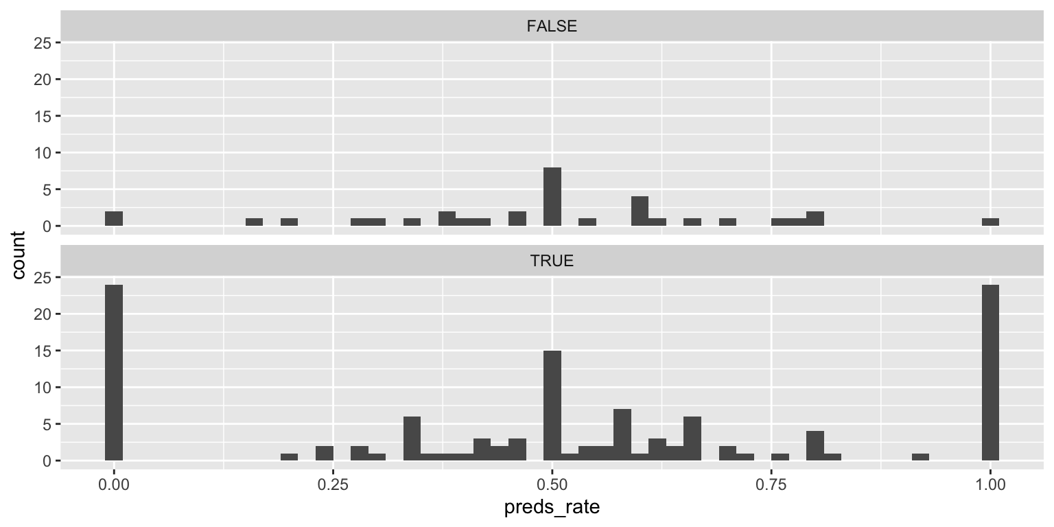
Add response here. Trimodal distribution for living prognosticators. There are far fewer inanimate than living prognosticators in the dataset.
- Make a color-coded frequency polygon with
geom_freqpoly(), mappingaliveto thecolorchannel. Set an appropriate binwidth.
ggplot(
  data = seers,
  mapping = aes(x = preds_rate, color = alive)
) +
  geom_freqpoly(binwidth = 0.02)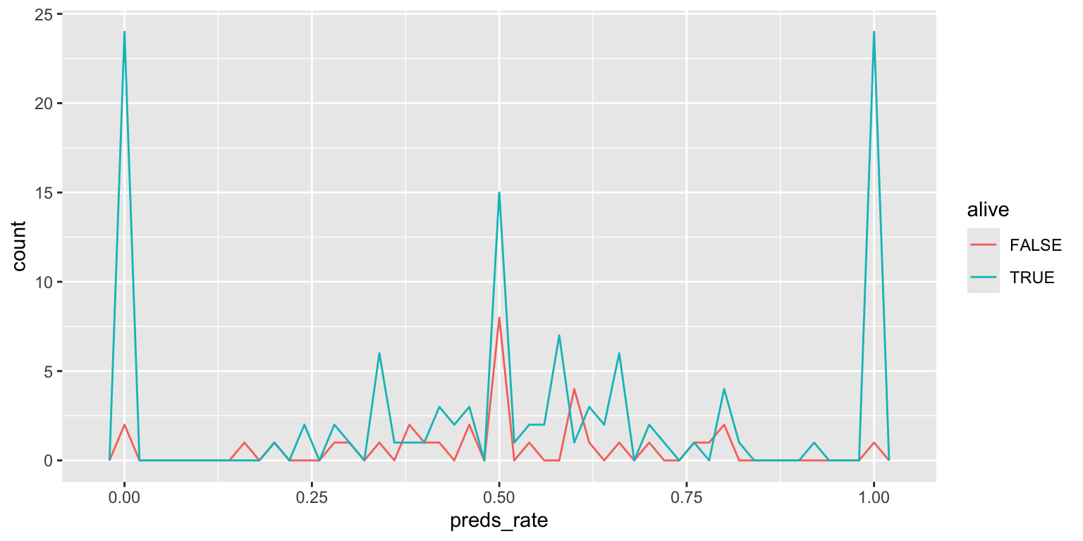
Add response here. Similar to faceted plot, but overlayed on the same panel so easier to make direct comparisons.
Histograms and frequency polygons are created using the same statistical transformation (stat_bin()). They both are used to
Visualize the distribution of a single continuous variable by dividing the \(x\) axis into bins and counting the number of observations in each bin. Histograms (
geom_histogram()) display the counts with bars; frequency polygons (geom_freqpoly()) display the counts with lines. Frequency polygons are more suitable when you want to compare the distribution across the levels of a categorical variable.
Note the significant challenge in interpreting this color-coded histogram:
ggplot(
  data = seers,
  mapping = aes(x = preds_rate, fill = alive)
) +
  geom_histogram(binwidth = 0.02, color = "white")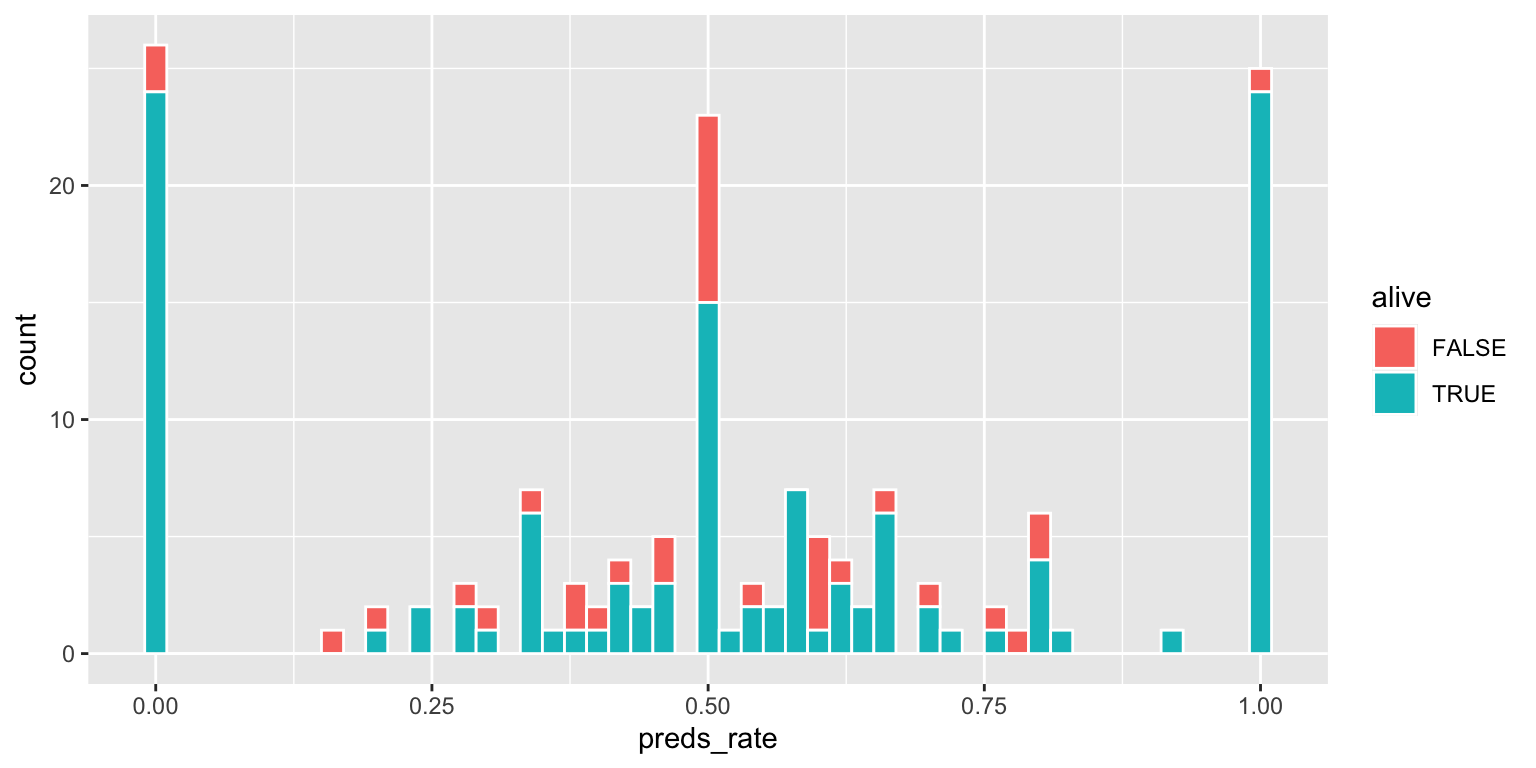
The interpretation depends on whether or not the FALSE bar segments are stacked on top of the TRUE bar segments, or are instead drawn underneath the TRUEbar segments with a common origin value of 0.
- Use a density plot. Add color as you see fit.
ggplot(
  data = seers,
  mapping = aes(x = preds_rate, fill = alive)
) +
  geom_density(alpha = 0.5)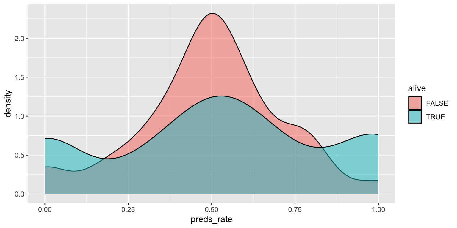
Add response here. Easier to compare density/distribution of rates between inanimate and living prognosticators, but not the absolute number of them.
- Use side-by-side box plots. Add color as you see fit and turn off legends if not needed.
You do not need to use faceting to create a box plot. Simply map the categorical and continuous variables to the appropriate axes and they are automatically drawn side-by-side.
ggplot(
  data = seers,
  mapping = aes(x = alive, y = preds_rate, fill = alive)
) +
  geom_boxplot(show.legend = FALSE)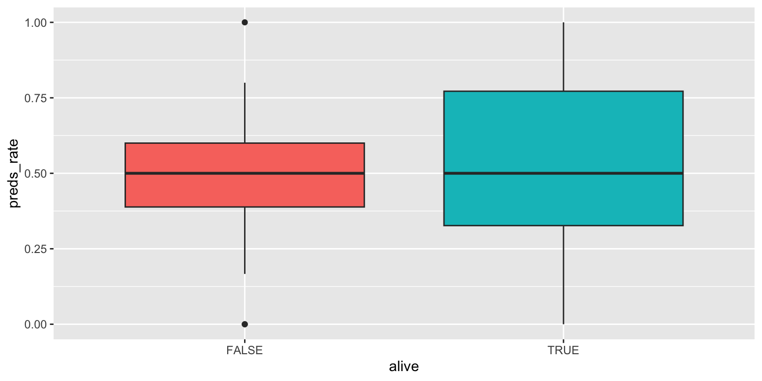
Add response here. Not a very useful plot for this dataset since it contains two modes at opposite ends of the range of values. Misleading in this context.
- Use a violin plot. Add color as you see fit and turn off legends if not needed.
# color
ggplot(
  data = seers,
  mapping = aes(x = alive, y = preds_rate, fill = alive)
) +
  geom_violin(alpha = 0.5, show.legend = FALSE)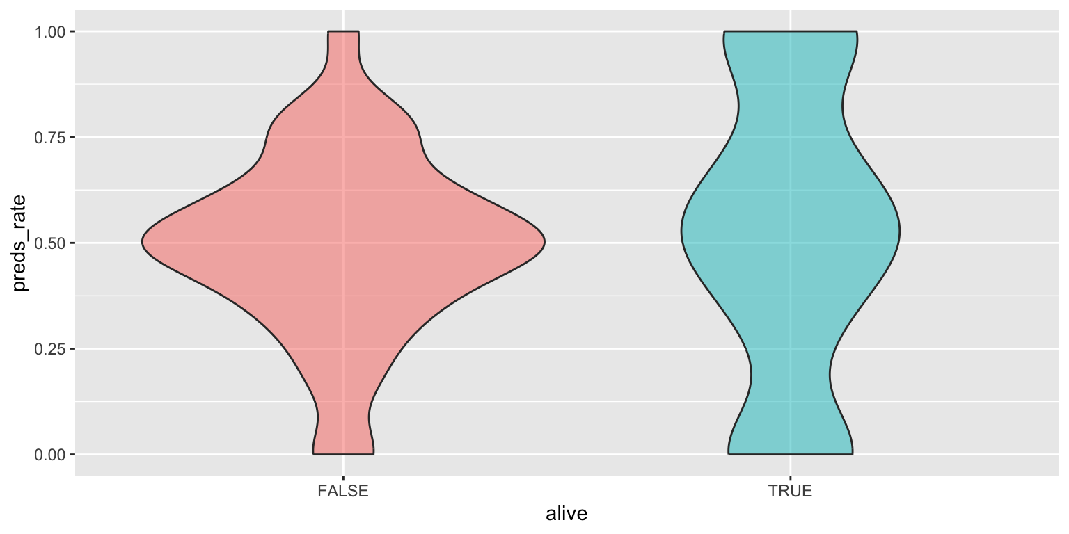
# no color
ggplot(
  data = seers,
  mapping = aes(x = alive, y = preds_rate)
) +
  geom_violin()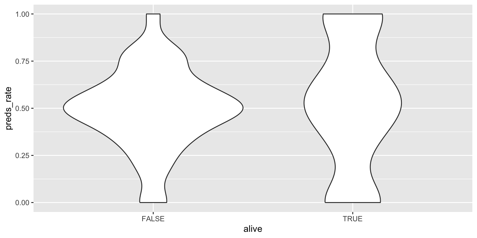
Add response here. Similar to the density plot but more of a boxplot form. Not sure how honest it is for this dataset since it still makes it appear like the peak modal value for living prognosticators is \(0.5\), even though there are more prognosticators at 0 and 1 each.
- Make a jittered scatter plot. Add color as you see fit and turn off legends if not needed.
ggplot(
  data = seers,
  mapping = aes(x = alive, y = preds_rate, color = alive)
) +
  geom_jitter(show.legend = FALSE)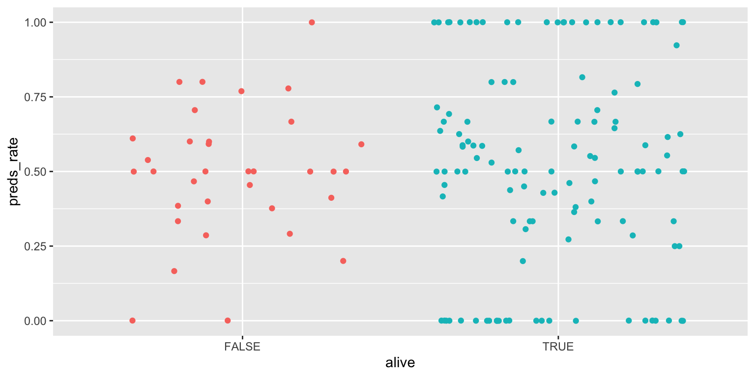
Add response here. Can see individual prognosticators. Helps identify which category has more observations, but the distribution summary is lost.
- Use beeswarm plots. Add color as you see fit and turn off legends if not needed.
library(ggbeeswarm)

ggplot(
  data = seers,
  mapping = aes(x = alive, y = preds_rate, color = alive)
) +
  geom_beeswarm(show.legend = FALSE)
Add response here. Better than the jittered scatter plot since it organizes the points and allows us to see the distribution more clearly. If we had a lot more observations, the graph would be cluttered.
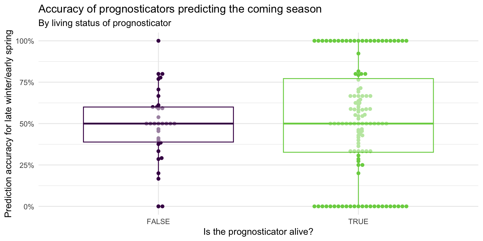
- Demonstration: Use multiple geoms on a single plot. Be deliberate about the order of plotting. Change the theme and the color scale of the plot. Finally, add informative labels.
ggplot(
  data = seers,
  mapping = aes(x = alive, y = preds_rate, color = alive)
) +
  geom_beeswarm(show.legend = FALSE) +
  geom_boxplot(show.legend = FALSE, alpha = 0.5) +
  scale_color_viridis_d(option = "D", end = 0.8) +
  scale_y_continuous(labels = label_percent()) +
  theme_minimal() +
  labs(
    x = "Is the prognosticator alive?",
    y = "Prediction accuracy for late winter/early spring",
    title = "Accuracy of prognosticators predicting the coming season",
    subtitle = "By living status of prognosticator"
  )
Multiple variables - Demo
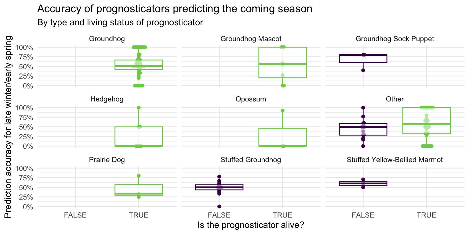
Analyzing the relationship between three or more variables is called multivariate analysis.
- Facet the plot you created in the previous exercise by
forecaster_simple. Adjust labels accordingly.
ggplot(
  data = seers,
  mapping = aes(x = alive, y = preds_rate, color = alive)
) +
  geom_beeswarm(show.legend = FALSE) +
  geom_boxplot(show.legend = FALSE, alpha = 0.5) +
  scale_color_viridis_d(option = "D", end = 0.8) +
  scale_y_continuous(labels = label_percent()) +
  facet_wrap(vars(forecaster_simple)) +
  theme_minimal() +
  labs(
    x = "Is the prognosticator alive?",
    y = "Prediction accuracy for late winter/early spring",
    title = "Accuracy of prognosticators predicting the coming season",
    subtitle = "By type and living status of prognosticator"
  )
Before you continue, let’s turn off all warnings the code chunks generate and resize all figures. We’ll do this by adding these execute options to the YAML header.
---
execute:
  fig-width: 8
  fig-height: 4
  warning: false
---
Visualizing other variables - Your turn!
- Pick a single categorical variable from the data set and make a bar plot of its distribution. What do you learn
# frequency count of forecaster_simple
ggplot(data = seers, mapping = aes(y = forecaster_simple)) +
  geom_bar() +
  theme_minimal() +
  labs(
    title = "Groundhogs are the most prevalent type of prognosticator",
    x = "Number of prognosticators",
    y = NULL
  )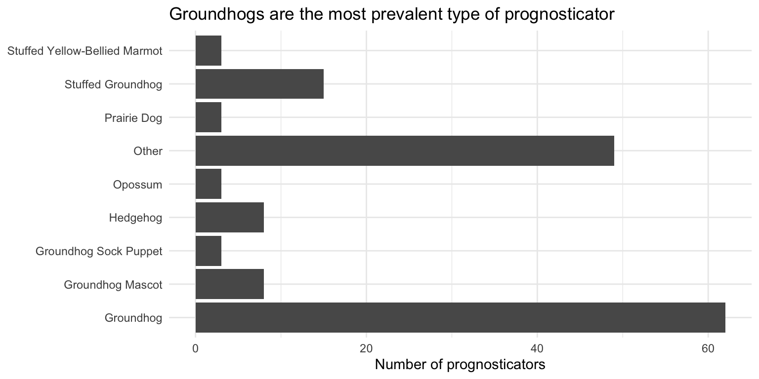
The \(y\)-axis is sorted alphabetically which doesn’t make a lot of sense, but fixing it requires some data wrangling (which we will learn next week!). Overall groundhogs are the most prevalent type of prognosticator.
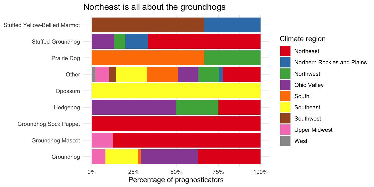
- Pick two categorical variables and make a visualization to visualize the relationship between the two variables. Along with your code and output, provide an interpretation of the visualization.
# forecaster_simple vs. climate_region as a relative frequency bar chart
ggplot(data = seers, mapping = aes(y = forecaster_simple, fill = climate_region)) +
  # position = "fill" makes the bars the same height
  geom_bar(position = "fill") +
  # percentage labeling
  scale_x_continuous(labels = label_percent()) +
  # use better color palette
  scale_fill_brewer(type = "qual", palette = "Set1") +
  theme_minimal() +
  labs(
    title = "Northeast is all about the groundhogs",
    x = "Percentage of prognosticators",
    y = NULL,
    fill = "Climate region"
  )
# now as a count plot
ggplot(data = seers, mapping = aes(x = climate_region, y = forecaster_simple)) +
  geom_count() +
  labs(
    title = "Northeast is all about the groundhogs",
    x = "Climate region",
    y = "Type of prognosticator",
    size = "Number of\nprognosticators"
  ) +
  theme_minimal() +
  theme(legend.position = "bottom")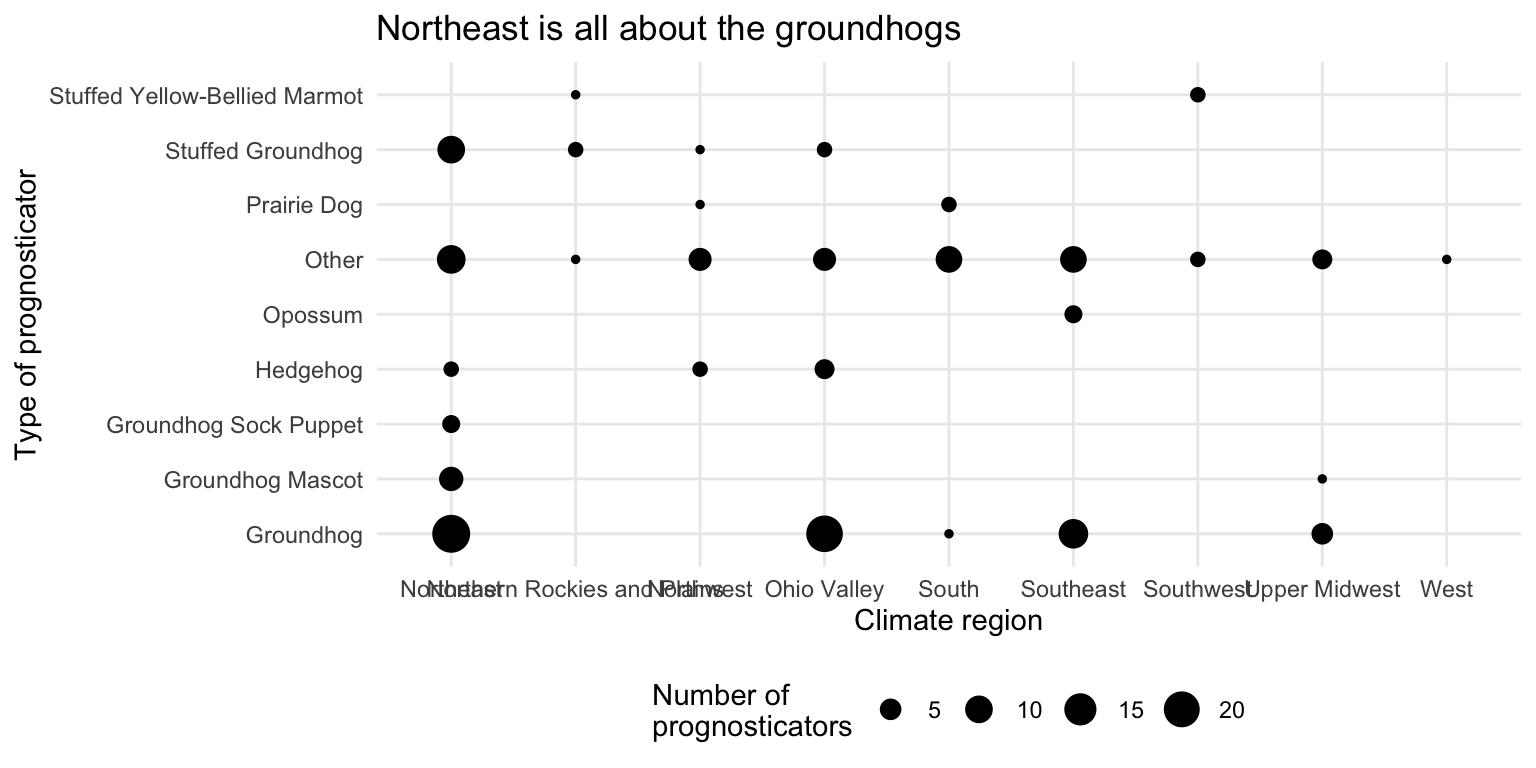
It’s rather hard to visualize two categorical variables at once. The first plot shows the relative frequency of each type of prognosticator by climate region. The second plot shows the count of each type of prognosticator by climate region. Both plots show that the Northeast has a high proportion of groundhogs as prognosticators. Unfortunately we end up with overlapping labels on the second plot, while with the first graph we cannot tell the overall number of prognosticators by each type (everything is scaled to 100%).
- Make another plot that uses at least three variables. At least one should be numeric and at least one categorical. In 1-2 sentences, describe what the plot shows about the relationships between the variables you plotted. Don’t forget to label your code chunk.
ggplot(data = seers, mapping = aes(
  x = temp_mean, y = preds_long_winter_pct,
  color = alive
)) +
  geom_point() +
  geom_smooth(method = "lm", se = FALSE) +
  scale_x_continuous(
    labels = label_number(suffix = "\u00b0F")
  ) +
  scale_color_viridis_d(option = "D", end = 0.8) +
  scale_y_continuous(labels = label_percent()) +
  labs(
    title = "Inanimate prognosticators are more likely to predict a long winter\nas average temperatures rise",
    x = "Average temperature in February/March during pronosticators' 'lifetime'",
    y = "Percentage of predictions for long winter",
    color = "Is the prognosticator alive?"
  ) +
  theme_minimal() +
  theme(legend.position = "top")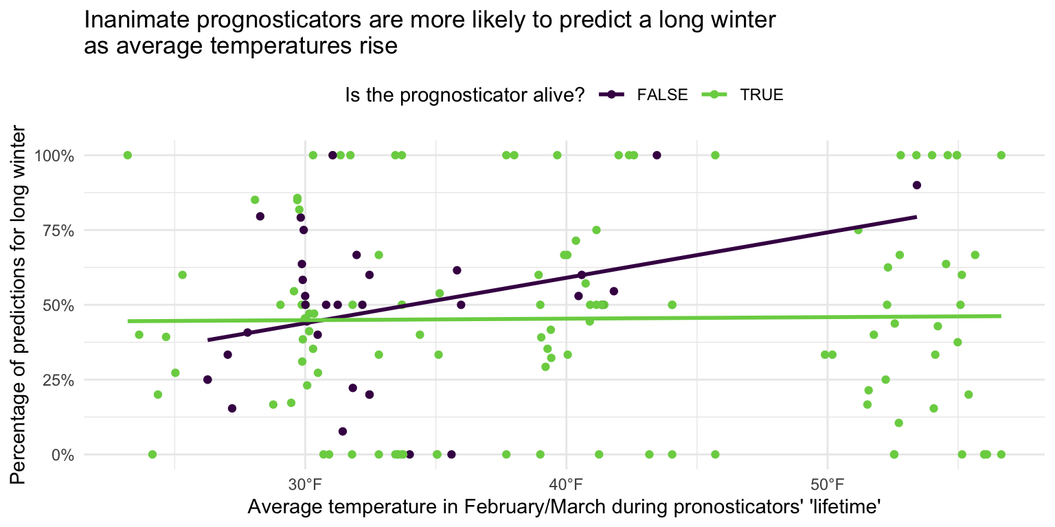
As average temperatures in February and March rise, inanimate prognosticators are associated with a higher likelihood of predicting a long winter. For living prognosticators, the relationship is less clear. The smoothing line is virtually flat, suggesting there is no association between average winter temperatures and whether or not the prognosticator predicts a long winter or early spring.
sessioninfo::session_info()─ Session info ───────────────────────────────────────────────────────────────
setting value
version R version 4.4.2 (2024-10-31)
os macOS Sonoma 14.6.1
system aarch64, darwin20
ui X11
language (EN)
collate en_US.UTF-8
ctype en_US.UTF-8
tz America/New_York
date 2025-01-31
pandoc 3.4 @ /usr/local/bin/ (via rmarkdown)
─ Packages ───────────────────────────────────────────────────────────────────
package * version date (UTC) lib source
archive 1.1.9 2024-09-12 [1] CRAN (R 4.4.1)
beeswarm 0.4.0 2021-06-01 [1] CRAN (R 4.3.0)
bit 4.0.5 2022-11-15 [1] CRAN (R 4.3.0)
bit64 4.0.5 2020-08-30 [1] CRAN (R 4.3.0)
cli 3.6.3 2024-06-21 [1] CRAN (R 4.4.0)
crayon 1.5.3 2024-06-20 [1] CRAN (R 4.4.0)
dichromat 2.0-0.1 2022-05-02 [1] CRAN (R 4.3.0)
digest 0.6.35 2024-03-11 [1] CRAN (R 4.3.1)
dplyr * 1.1.4 2023-11-17 [1] CRAN (R 4.3.1)
evaluate 0.24.0 2024-06-10 [1] CRAN (R 4.4.0)
farver 2.1.2 2024-05-13 [1] CRAN (R 4.3.3)
fastmap 1.2.0 2024-05-15 [1] CRAN (R 4.4.0)
forcats * 1.0.0 2023-01-29 [1] CRAN (R 4.3.0)
generics 0.1.3 2022-07-05 [1] CRAN (R 4.3.0)
ggbeeswarm * 0.7.2 2023-04-29 [1] CRAN (R 4.3.0)
ggplot2 * 3.5.1 2024-04-23 [1] CRAN (R 4.3.1)
glue 1.8.0 2024-09-30 [1] CRAN (R 4.4.1)
gtable 0.3.5 2024-04-22 [1] CRAN (R 4.3.1)
here 1.0.1 2020-12-13 [1] CRAN (R 4.3.0)
hms 1.1.3 2023-03-21 [1] CRAN (R 4.3.0)
htmltools 0.5.8.1 2024-04-04 [1] CRAN (R 4.3.1)
htmlwidgets 1.6.4 2023-12-06 [1] CRAN (R 4.3.1)
jsonlite 1.8.9 2024-09-20 [1] CRAN (R 4.4.1)
knitr 1.47 2024-05-29 [1] CRAN (R 4.4.0)
labeling 0.4.3 2023-08-29 [1] CRAN (R 4.3.0)
lattice 0.22-6 2024-03-20 [1] CRAN (R 4.4.2)
lifecycle 1.0.4 2023-11-07 [1] CRAN (R 4.3.1)
lubridate * 1.9.3 2023-09-27 [1] CRAN (R 4.3.1)
magrittr 2.0.3 2022-03-30 [1] CRAN (R 4.3.0)
Matrix 1.7-1 2024-10-18 [1] CRAN (R 4.4.2)
mgcv 1.9-1 2023-12-21 [1] CRAN (R 4.4.2)
nlme 3.1-166 2024-08-14 [1] CRAN (R 4.4.2)
pillar 1.10.1 2025-01-07 [1] CRAN (R 4.4.1)
pkgconfig 2.0.3 2019-09-22 [1] CRAN (R 4.3.0)
purrr * 1.0.2 2023-08-10 [1] CRAN (R 4.3.0)
R6 2.5.1 2021-08-19 [1] CRAN (R 4.3.0)
RColorBrewer 1.1-3 2022-04-03 [1] CRAN (R 4.3.0)
readr * 2.1.5 2024-01-10 [1] CRAN (R 4.3.1)
rlang 1.1.4 2024-06-04 [1] CRAN (R 4.3.3)
rmarkdown 2.27 2024-05-17 [1] CRAN (R 4.4.0)
rprojroot 2.0.4 2023-11-05 [1] CRAN (R 4.3.1)
rstudioapi 0.17.0 2024-10-16 [1] CRAN (R 4.4.1)
scales * 1.3.0.9000 2024-11-14 [1] Github (r-lib/scales@ee03582)
sessioninfo 1.2.2 2021-12-06 [1] CRAN (R 4.3.0)
stringi 1.8.4 2024-05-06 [1] CRAN (R 4.3.1)
stringr * 1.5.1 2023-11-14 [1] CRAN (R 4.3.1)
tibble * 3.2.1 2023-03-20 [1] CRAN (R 4.3.0)
tidyr * 1.3.1 2024-01-24 [1] CRAN (R 4.3.1)
tidyselect 1.2.1 2024-03-11 [1] CRAN (R 4.3.1)
tidyverse * 2.0.0 2023-02-22 [1] CRAN (R 4.3.0)
timechange 0.3.0 2024-01-18 [1] CRAN (R 4.3.1)
tzdb 0.4.0 2023-05-12 [1] CRAN (R 4.3.0)
vctrs 0.6.5 2023-12-01 [1] CRAN (R 4.3.1)
vipor 0.4.7 2023-12-18 [1] CRAN (R 4.3.1)
viridisLite 0.4.2 2023-05-02 [1] CRAN (R 4.3.0)
vroom 1.6.5 2023-12-05 [1] CRAN (R 4.3.1)
withr 3.0.2 2024-10-28 [1] CRAN (R 4.4.1)
xfun 0.50.5 2025-01-15 [1] https://yihui.r-universe.dev (R 4.4.2)
yaml 2.3.10 2024-07-26 [1] CRAN (R 4.4.0)
[1] /Library/Frameworks/R.framework/Versions/4.4-arm64/Resources/library
──────────────────────────────────────────────────────────────────────────────