AE 01: Visualizing world development indicators using the grammar of graphics and {ggplot2}

Suggested answers

Application exercise
Answers
Modified

January 28, 2025

Important

These are suggested answers. This document should be used as reference only, it’s not designed to be an exhaustive key.

The World Bank maintains an extensive database of global development data. In this application exercise we will visualize a handful of development indicators.

Getting started

Packages

We need to use two packages for these exercises:

  • {tidyverse} for the data visualization
  • {scales} for formatting plot labels
── Attaching core tidyverse packages ──────────────────────── tidyverse 2.0.0 ──
✔ dplyr     1.1.4     ✔ readr     2.1.5
✔ forcats   1.0.0     ✔ stringr   1.5.1
✔ ggplot2   3.5.1     ✔ tibble    3.2.1
✔ lubridate 1.9.3     ✔ tidyr     1.3.1
✔ purrr     1.0.2     
── Conflicts ────────────────────────────────────────── tidyverse_conflicts() ──
✖ purrr::%||%()   masks base::%||%()
✖ dplyr::filter() masks stats::filter()
✖ dplyr::lag()    masks stats::lag()
ℹ Use the conflicted package (<http://conflicted.r-lib.org/>) to force all conflicts to become errors

Attaching package: 'scales'

The following object is masked from 'package:purrr':

    discard

The following object is masked from 'package:readr':

    col_factor

Data

The data are stored as a CSV (comma separated values) file in the data folder of your repository. Let’s read it from there and save it as an object called wdi.

The data is stored in a CSV (Comma-Separated Values) file in the data folder of the repository. We’ll import the data and save it as an object called wdi.

wdi <- read_csv("data/wdi.csv")

Get to know the data

We can use the glimpse() function to get an overview (or “glimpse”) of the data.

glimpse(wdi)
Rows: 2,821
Columns: 8
$ country  <chr> "Afghanistan", "Afghanistan", "Afghanistan", "Afghanistan", "…
$ iso2c    <chr> "AF", "AF", "AF", "AF", "AF", "AF", "AF", "AF", "AF", "AF", "…
$ iso3c    <chr> "AFG", "AFG", "AFG", "AFG", "AFG", "AFG", "AFG", "AFG", "AFG"…
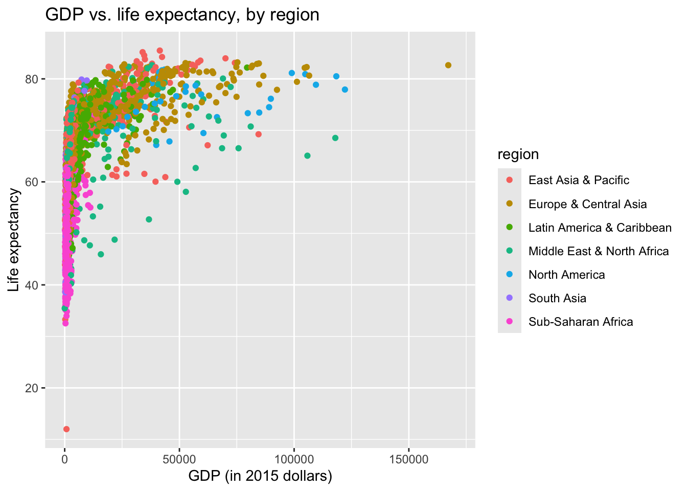
$ region   <chr> "South Asia", "South Asia", "South Asia", "South Asia", "Sout…
$ year     <dbl> 1960, 1965, 1970, 1975, 1980, 1985, 1990, 1995, 2000, 2005, 2…
$ life_exp <dbl> 32.535, 34.953, 37.418, 40.100, 39.618, 33.550, 45.967, 52.54…
$ pop      <dbl> 9035043, 10036008, 11290128, 12773954, 13169311, 11426852, 12…
$ gdp      <dbl> NA, NA, NA, NA, NA, NA, NA, NA, 308.3183, 363.6401, 542.8710,…
  • What does each observation (row) in the data set represent?

Each observation represents a different country-year.

  • How many observations (rows) are in the data set?

There are 2821 observations in the dataset.

  • How many variables (columns) are in the data set?

There are 8 columns in the dataset.

Variables of interest

The data contains the following variables:

  • country - name of the country
  • iso2c and iso3c - standardized two and three-letter designations respectively for each country
  • region - the World Bank classifies countries into seven distinct geographic regions
  • year - the year for which the measures are reported
  • life_exp - life expectancy at birth, measured in total (years)
  • pop - total population
  • gdp - GDP per capita (inflation-adjusted 2015 U.S. dollars)

Visualizing data with {ggplot2}

{ggplot2} is the package and ggplot() is the core function used to create a plot.

  • ggplot() creates the initial base coordinate system, and we will add layers to that base. We first specify the data set we will use with data = bechdel.
ggplot(data = wdi)

  • The mapping argument defines which variables in the data frame are mapped with specific aesthetics, or the visual channels used to communicate information in the graph.
ggplot(
  data = wdi,
  mapping = aes(x = gdp, y = life_exp)
)

  • The geom_*() function specifies the type of plot we want to use to represent the data. In the code below, we use geom_point() which creates a plot where each observation is represented by a point.
ggplot(
  data = wdi,
  mapping = aes(x = gdp, y = life_exp)
) +
  geom_point()
Warning: Removed 639 rows containing missing values or values outside the scale range
(`geom_point()`).

Note that this results in a warning as well. What does the warning mean?

Add response here. In this case, it means that 639 observations have a missing value for either gdp or life_exp. geom_point() automatically removes those rows in order to successfully draw the graph.

GDP vs. life expectancy

Step 1 - Your turn

Modify the following plot to change the color of all points to a different color.

Specifying colors in R

See http://www.stat.columbia.edu/~tzheng/files/Rcolor.pdf for many color options you can use by name in R or use the hex code for a color of your choice.

ggplot(
  data = wdi,
  mapping = aes(x = gdp, y = life_exp)
) +
  geom_point(color = "orange")

Step 2 - Your turn

Add labels for the title and \(x\) and \(y\) axes.

ggplot(
  data = wdi,
  mapping = aes(x = gdp, y = life_exp)
) +
  geom_point(color = "orange") +
  labs(
    x = "GDP (in 2015 dollars)",
    y = "Life expectancy",
    title = "GDP vs. life expectancy"
  )

Step 3 - Your turn

An aesthetic is a visual property of one of the objects in your plot. Commonly used aesthetic options are:

  • color
  • fill
  • shape
  • size
  • alpha (transparency)

Modify the plot below, so the color of the points is based on the variable region.

ggplot(
  data = wdi,
  mapping = aes(x = gdp, y = life_exp, color = region)
) +
  geom_point() +
  labs(
    x = "GDP (in 2015 dollars)",
    y = "Life expectancy",
    title = "GDP vs. life expectancy, by region"
  )

Step 4 - Your turn

Expand on your plot from the previous step to make the size of your points based on pop.

ggplot(
  data = wdi,
  mapping = aes(x = gdp, y = life_exp, color = region, size = pop)
) +
  geom_point() +
  labs(
    x = "GDP (in 2015 dollars)",
    y = "Life expectancy",
    title = "GDP vs. life expectancy"
  )

Step 5 - Your turn

Expand on your plot from the previous step to make the transparency (alpha) of the points 0.5.

ggplot(
  data = wdi,
  mapping = aes(x = gdp, y = life_exp, color = region, size = pop)
) +
  geom_point(alpha = 0.5) +
  labs(
    x = "GDP (in 2015 dollars)",
    y = "Life expectancy",
    title = "GDP vs. life expectancy, by region and population"
  )

Step 6 - Your turn

Expand on your plot from the previous step by using facet_wrap() to display the association between GDP and life expectancy for each region.

ggplot(
  data = wdi,
  mapping = aes(x = gdp, y = life_exp, color = region, size = pop)
) +
  geom_point(alpha = 0.5) +
  facet_wrap(facets = vars(region)) +
  labs(
    x = "GDP (in 2015 dollars)",
    y = "Life expectancy",
    title = "GDP vs. life expectancy, by region and population"
  )

Step 7 - Demo

Improve your plot from the previous step by making the \(x\) and \(size\) guides more legible.

Tip

Make use of the {scales} package, specifically the scale_x_continuous() and scale_size_area() functions.

ggplot(
  data = wdi,
  mapping = aes(x = gdp, y = life_exp, color = region, size = pop)
) +
  geom_point(alpha = 0.5) +
  scale_x_continuous(labels = label_currency(scale_cut = cut_short_scale())) +
  scale_size_area(labels = label_number(scale_cut = cut_short_scale())) +
  facet_wrap(facets = vars(region)) +
  labs(
    x = "GDP (in 2015 dollars)",
    y = "Life expectancy",
    title = "GDP vs. life expectancy, by region and population"
  )

Step 8 - Demo

What other improvements could we make to this plot?

Recommended improvements
  • Remove the legend for region since it duplicates the facet labels
  • Move the legend to the top of the plot
  • Add a clear title for the legend
  • Transform the \(x\) axis to use log-10 scaling (account for skewness in the GDP variable)
ggplot(
  data = wdi,
  mapping = aes(x = gdp, y = life_exp, color = region, size = pop)
) +
  geom_point(alpha = 0.5) +
  scale_x_log10(labels = label_currency(scale_cut = cut_short_scale())) +
  scale_size_area(labels = label_number(scale_cut = cut_short_scale())) +
  scale_color_discrete(guide = "none") +
  facet_wrap(facets = vars(region)) +
  labs(
    x = "GDP (in 2015 dollars)",
    y = "Life expectancy",
    title = "GDP vs. life expectancy, by region and population",
    size = "Population"
  ) +
  theme(legend.position = "top")

Life expectancy by region

Step 1 - Your turn

Create side-by-side vertical box plots of life_exp by region.

ggplot(data = wdi, mapping = aes(x = region, y = life_exp)) +
  geom_boxplot() +
  labs(
    x = "Region",
    y = "Life expectancy",
    title = "Distribution of life expectancy, by region"
  )

Step 2 - Your turn

Many of the region labels on the \(x\) axis are overlapping and difficult to read. Recreate the plot orienting the box plots horizontally.

ggplot(data = wdi, mapping = aes(x = life_exp, y = region)) +
  geom_boxplot() +
  labs(
    x = "Life expectancy",
    y = "Region",
    title = "Distribution of life expectancy, by region"
  )

What does this graph tell you about life expectancy?

Add response here. North American and Europe & Central Asia countries have the highest typical life expectancies, whereas South Asia and Sub-Saharan Africa have the lowest typical life expectancies. African and Asian countries also tend to have wider variations in life expectancy compared to North American and Europe & Central Asia.

Acknowledgments

sessioninfo::session_info()
─ Session info ───────────────────────────────────────────────────────────────
 setting  value
 version  R version 4.4.2 (2024-10-31)
 os       macOS Sonoma 14.6.1
 system   aarch64, darwin20
 ui       X11
 language (EN)
 collate  en_US.UTF-8
 ctype    en_US.UTF-8
 tz       America/New_York
 date     2025-01-29
 pandoc   3.4 @ /usr/local/bin/ (via rmarkdown)

─ Packages ───────────────────────────────────────────────────────────────────
 package      * version    date (UTC) lib source
 archive        1.1.9      2024-09-12 [1] CRAN (R 4.4.1)
 bit            4.0.5      2022-11-15 [1] CRAN (R 4.3.0)
 bit64          4.0.5      2020-08-30 [1] CRAN (R 4.3.0)
 cli            3.6.3      2024-06-21 [1] CRAN (R 4.4.0)
 crayon         1.5.3      2024-06-20 [1] CRAN (R 4.4.0)
 dichromat      2.0-0.1    2022-05-02 [1] CRAN (R 4.3.0)
 digest         0.6.35     2024-03-11 [1] CRAN (R 4.3.1)
 dplyr        * 1.1.4      2023-11-17 [1] CRAN (R 4.3.1)
 evaluate       0.24.0     2024-06-10 [1] CRAN (R 4.4.0)
 fansi          1.0.6      2023-12-08 [1] CRAN (R 4.3.1)
 farver         2.1.2      2024-05-13 [1] CRAN (R 4.3.3)
 fastmap        1.2.0      2024-05-15 [1] CRAN (R 4.4.0)
 forcats      * 1.0.0      2023-01-29 [1] CRAN (R 4.3.0)
 generics       0.1.3      2022-07-05 [1] CRAN (R 4.3.0)
 ggplot2      * 3.5.1      2024-04-23 [1] CRAN (R 4.3.1)
 glue           1.8.0      2024-09-30 [1] CRAN (R 4.4.1)
 gtable         0.3.5      2024-04-22 [1] CRAN (R 4.3.1)
 here           1.0.1      2020-12-13 [1] CRAN (R 4.3.0)
 hms            1.1.3      2023-03-21 [1] CRAN (R 4.3.0)
 htmltools      0.5.8.1    2024-04-04 [1] CRAN (R 4.3.1)
 htmlwidgets    1.6.4      2023-12-06 [1] CRAN (R 4.3.1)
 jsonlite       1.8.9      2024-09-20 [1] CRAN (R 4.4.1)
 knitr          1.47       2024-05-29 [1] CRAN (R 4.4.0)
 labeling       0.4.3      2023-08-29 [1] CRAN (R 4.3.0)
 lifecycle      1.0.4      2023-11-07 [1] CRAN (R 4.3.1)
 lubridate    * 1.9.3      2023-09-27 [1] CRAN (R 4.3.1)
 magrittr       2.0.3      2022-03-30 [1] CRAN (R 4.3.0)
 pillar         1.9.0      2023-03-22 [1] CRAN (R 4.3.0)
 pkgconfig      2.0.3      2019-09-22 [1] CRAN (R 4.3.0)
 purrr        * 1.0.2      2023-08-10 [1] CRAN (R 4.3.0)
 R6             2.5.1      2021-08-19 [1] CRAN (R 4.3.0)
 RColorBrewer   1.1-3      2022-04-03 [1] CRAN (R 4.3.0)
 readr        * 2.1.5      2024-01-10 [1] CRAN (R 4.3.1)
 rlang          1.1.4      2024-06-04 [1] CRAN (R 4.3.3)
 rmarkdown      2.27       2024-05-17 [1] CRAN (R 4.4.0)
 rprojroot      2.0.4      2023-11-05 [1] CRAN (R 4.3.1)
 rstudioapi     0.17.0     2024-10-16 [1] CRAN (R 4.4.1)
 scales       * 1.3.0.9000 2024-11-14 [1] Github (r-lib/scales@ee03582)
 sessioninfo    1.2.2      2021-12-06 [1] CRAN (R 4.3.0)
 stringi        1.8.4      2024-05-06 [1] CRAN (R 4.3.1)
 stringr      * 1.5.1      2023-11-14 [1] CRAN (R 4.3.1)
 tibble       * 3.2.1      2023-03-20 [1] CRAN (R 4.3.0)
 tidyr        * 1.3.1      2024-01-24 [1] CRAN (R 4.3.1)
 tidyselect     1.2.1      2024-03-11 [1] CRAN (R 4.3.1)
 tidyverse    * 2.0.0      2023-02-22 [1] CRAN (R 4.3.0)
 timechange     0.3.0      2024-01-18 [1] CRAN (R 4.3.1)
 tzdb           0.4.0      2023-05-12 [1] CRAN (R 4.3.0)
 utf8           1.2.4      2023-10-22 [1] CRAN (R 4.3.1)
 vctrs          0.6.5      2023-12-01 [1] CRAN (R 4.3.1)
 vroom          1.6.5      2023-12-05 [1] CRAN (R 4.3.1)
 withr          3.0.2      2024-10-28 [1] CRAN (R 4.4.1)
 xfun           0.50.5     2025-01-15 [1] https://yihui.r-universe.dev (R 4.4.2)
 yaml           2.3.10     2024-07-26 [1] CRAN (R 4.4.0)

 [1] /Library/Frameworks/R.framework/Versions/4.4-arm64/Resources/library

──────────────────────────────────────────────────────────────────────────────