AE 04: Pivoting Cornell Degrees
Goal
Our ultimate goal in this application exercise is to make the following data visualization.
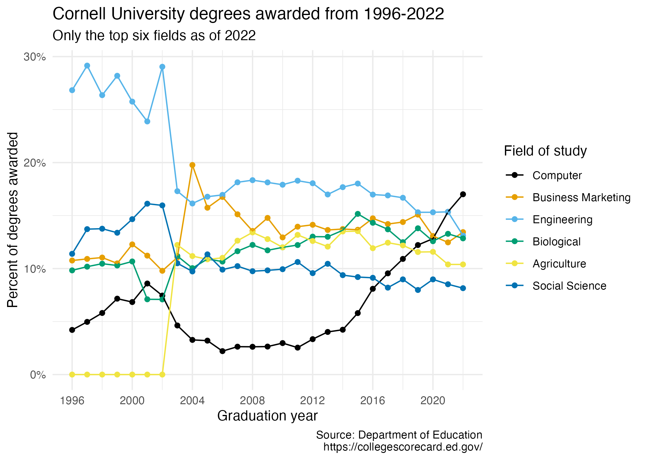
Your turn (3 minutes): Take a close look at the plot and describe what it shows in 2-3 sentences.
Add response here.
Data
The data come from the Department of Education’s College Scorecard.
They make the data available through online dashboards and an API, but I’ve prepared the data for you in a CSV file.
And let’s take a look at the data.
cornell_deg# A tibble: 6 × 29
field_of_study `1997` `1998` `1999` `2000` `2001` `2002` `2003` `2004` `2005`
<chr> <dbl> <dbl> <dbl> <dbl> <dbl> <dbl> <dbl> <dbl> <dbl>
1 Computer 0.0421 0.0497 0.0581 0.0716 0.0684 0.0859 0.0745 0.0463 0.0327
2 Business Marke… 0.108 0.109 0.110 0.105 0.123 0.112 0.0979 0.110 0.198
3 Engineering 0.268 0.292 0.264 0.282 0.258 0.239 0.290 0.173 0.161
4 Agriculture 0 0 0 0 0 0 0 0.122 0.112
5 Biological 0.0983 0.102 0.105 0.103 0.107 0.071 0.0709 0.112 0.100
6 Social Science 0.114 0.137 0.138 0.134 0.147 0.161 0.160 0.105 0.0973
# ℹ 19 more variables: `2006` <dbl>, `2007` <dbl>, `2008` <dbl>, `2009` <dbl>,
# `2010` <dbl>, `2011` <dbl>, `2012` <dbl>, `2013` <dbl>, `2014` <dbl>,
# `2015` <dbl>, `2016` <dbl>, `2017` <dbl>, `2018` <dbl>, `2019` <dbl>,
# `2020` <dbl>, `2021` <dbl>, `2022` <dbl>, `2023` <dbl>, `2024` <dbl>The dataset has 6 rows and 29 columns. The first column (variable) is the field_of_study, which are the 6 most frequent fields of study for students graduating in 2024.1 The remaining columns show the proportion of degrees awarded in each year from 1997-2024.
Your turn (4 minutes): Take a look at the plot we aim to make and sketch the data frame we need to make the plot. Determine what each row and each column of the data frame should be. Hint: We need data to be in columns to map to aesthetic elements of the plot.
Columns: Add response here
Rows: Add response here
Pivoting
Demo: Pivot the cornell_deg data frame longer such that each row represents a field of study / year combination and year and pctage of graduates for that year are columns in the data frame.
# add your code herePlotting
- Your turn (5 minutes): Now we start making our plot, but let’s not get too fancy right away. Create the following plot, which will serve as the “first draft” on the way to our Goal. Do this by adding on to your pipeline from earlier.
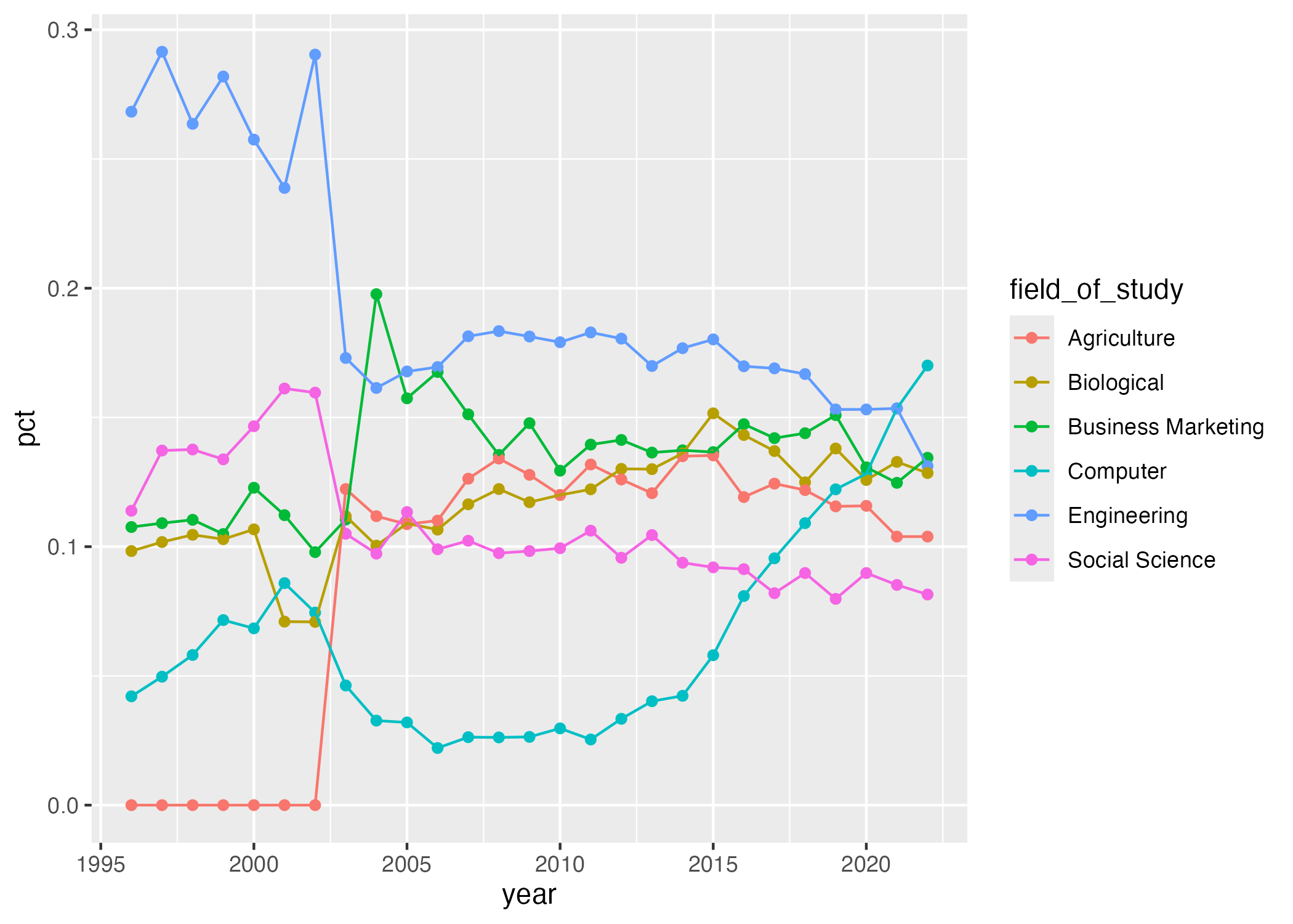
# add your code hereYour turn (4 minutes): What aspects of the plot need to be updated to go from the draft you created above to the Goal plot at the beginning of this application exercise.
Add response here.
Demo/your turn: Implement the updates you identified above. Finally, set fig-width: 7 and fig-height: 5 for your plot in the chunk options.
# add your code hereAcknowledgments
- This assignment is inspired by STA 199: Introduction to Data Science
Footnotes
For the sake of application, I omitted the other 32 possible fields of study.↩︎