AE 01: Visualizing college athletics financial data
Suggested answers
These are suggested answers. This document should be used as reference only, it’s not designed to be an exhaustive key.
For all analyses, we’ll use the {tidyverse} packages.
Data: The Knight-Newhouse College Athletics Database
College athletics in the United States are a big business. The Knight Commission on College Athletics is an independent organization that promotes the education, health, safety and success of college athletes. As part of this mission, the Commission maintains a database of college athletics finances for all public schools who compete in Division I (the top college athletics division).1 The data include information on revenues and expenses for each school’s athletics department, as well as information on student fees, enrollment, and other institutional characteristics.
We will analyze the 2024 fiscal year data for all public Division I schools which operate a football program. The data are stored in the file data/ncaa-finances.csv.
Rows: 193
Columns: 34
$ school                                                              <chr> "A…
$ fips                                                                <dbl> 1,…
$ stabbr                                                              <chr> "A…
$ ipeds_id                                                            <dbl> 10…
$ year                                                                <dbl> 20…
$ total_unduplicated_athletes                                         <dbl> 35…
$ number_of_sports_teams                                              <chr> "1…
$ ncaa_subdivision                                                    <chr> "F…
$ fbs_conference                                                      <chr> NA…
$ p4                                                                  <chr> NA…
$ other_revenue                                                       <dbl> 38…
$ corporate_sponsorship_advertising_licensing                         <dbl> 22…
$ donor_contributions                                                 <dbl> 12…
$ competition_guarantees_revenues                                     <dbl> 73…
$ conference_ncaa_distributions_media_rights_and_post_season_football <dbl> 84…
$ ticket_sales                                                        <dbl> 11…
$ institutional_government_support                                    <dbl> 12…
$ student_fees                                                        <dbl> 19…
$ total_revenue                                                       <dbl> 17…
$ allocated_revenue                                                   <dbl> 13…
$ allocated_revenue_pct                                               <dbl> 0.…
$ student_athlete_meals_non_travel                                    <dbl> 21…
$ excess_transfers_back                                               <dbl> 0,…
$ total_coaching_severance                                            <dbl> 0,…
$ other_expenses                                                      <dbl> 23…
$ medical                                                             <dbl> 0,…
$ competition_guarantees_expenses                                     <dbl> 85…
$ recruiting                                                          <dbl> 0,…
$ game_expenses_and_travel                                            <dbl> 23…
$ facilities_debt_service_and_equipment                               <dbl> 46…
$ coaches_compensation                                                <dbl> 21…
$ non_coaching_athletics_staff_compensation                           <dbl> 16…
$ athletic_student_aid                                                <dbl> 39…
$ total_expense                                                       <dbl> 17…
The database includes many variables related to revenues and expenses for each school’s athletics department, as well as information on student fees, enrollment, and other institutional characteristics. We will focus on a small subset of these variables for this exercise:
-
ncaa_subdivision: Whether the school competes in the Football Bowl Subdivision (FBS) or the Football Championship Subdivision (FCS) (previously classified as Division I-A and Division I-AA, respectively). -
total_expense: Total expenses paid by the athletics department (in USD). -
number_of_sports_teams: Number of sports teams sponsored by the athletics department.
We provide the remaining variables in the dataset for your own exploration.
Visualizing student fees
Single variable - Demo
Analyzing the a single variable is called univariate analysis.
Create visualizations of the distribution of total_expense (sum of all expenses paid by a school’s athletics department). Write a 1-2 sentence interpretation of the graph and what you learn from it.
- Make a histogram. Set an appropriate binwidth.
ggplot(data = ncaa, mapping = aes(x = total_expense)) +
  geom_histogram(binwidth = 1e07)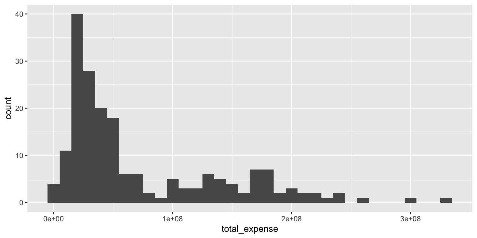
Add response here. The distribution of total expenses is heavily skewed, with most schools spending less than $100 million, but a few schools spending significantly more, upwards of $300 million.
Two variables - Your turn
Analyzing the relationship between two variables is called bivariate analysis.
Create visualizations of the distribution of total_expense by ncaa_subdivision (whether the school competes in the Football Bowl Subdivision or the Football Championship Subdivision). For each plot, write a 1-2 sentence interpretation of the graph and what you learn from it.
- Use multiple histograms via faceting, one for each type, and set an appropriate binwidth.
ggplot(
  data = ncaa,
  mapping = aes(x = total_expense)
) +
  geom_histogram(binwidth = 1e07) +
  facet_wrap(facets = vars(ncaa_subdivision), ncol = 1)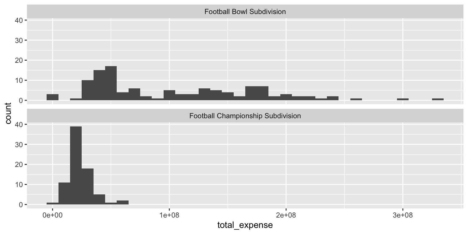
Add response here. The distribution of total expenses is quite different between the two subdivisions. FBS schools tend to have higher expenses, with a wider range of spending, while FCS schools generally have lower expenses, with most schools spending under $50 million. That said, there is also a substantial number of FBS schools with expenses below $50 million.
- Make a color-coded frequency polygon with
geom_freqpoly(), mappingncaa_subdivisionto thecolorchannel. Set an appropriate binwidth.
ggplot(
  data = ncaa,
  mapping = aes(x = total_expense, color = ncaa_subdivision)
) +
  geom_freqpoly(binwidth = 1e07)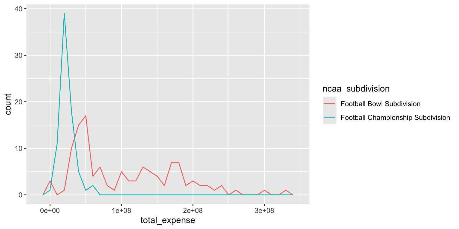
Add response here. The frequency polygon allows us to compare the distributions of total expenses between FBS and FCS schools directly overlaid on a single plot. We can see that FBS schools have a broader range of expenses, while FCS schools are more concentrated at lower expense levels.
Histograms and frequency polygons are created using the same statistical transformation (stat_bin()). They both are used to
Visualize the distribution of a single continuous variable by dividing the \(x\) axis into bins and counting the number of observations in each bin. Histograms (
geom_histogram()) display the counts with bars; frequency polygons (geom_freqpoly()) display the counts with lines. Frequency polygons are more suitable when you want to compare the distribution across the levels of a categorical variable.
Note the significant challenge in interpreting this color-coded histogram:
ggplot(
  data = ncaa,
  mapping = aes(x = total_expense, fill = ncaa_subdivision)
) +
  geom_histogram(binwidth = 1e07, color = "white")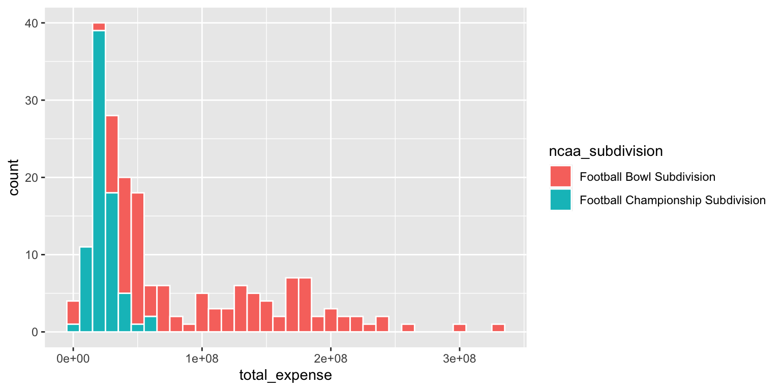
The interpretation depends on whether or not the FALSE bar segments are stacked on top of the TRUE bar segments, or are instead drawn underneath the TRUEbar segments with a common origin value of 0.
- Use a density plot. Add color as you see fit.
ggplot(
  data = ncaa,
  mapping = aes(x = total_expense, fill = ncaa_subdivision)
) +
  geom_density(alpha = 0.5)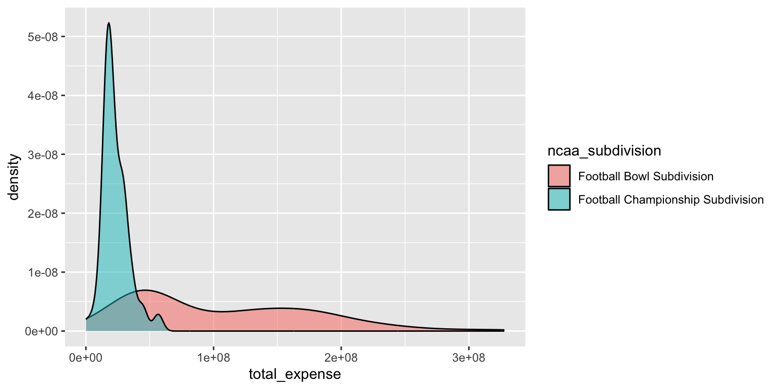
Add response here. The density plot provides a smoothed estimate of the distribution of total expenses for both FBS and FCS schools. It shows that FBS schools have a wider range of expenses, while FCS schools are more concentrated at lower expense levels, similar to the frequency polygon. However the density value on the y-axis is less intuitive than counts and is better for relative comparisons of distributions between categories.
- Use side-by-side box plots. Add color as you see fit and turn off legends if not needed.
You do not need to use faceting to create a box plot. Simply map the categorical and continuous variables to the appropriate axes and they are automatically drawn side-by-side.
ggplot(
  data = ncaa,
  mapping = aes(
    x = ncaa_subdivision,
    y = total_expense,
    fill = ncaa_subdivision
  )
) +
  geom_boxplot(show.legend = FALSE)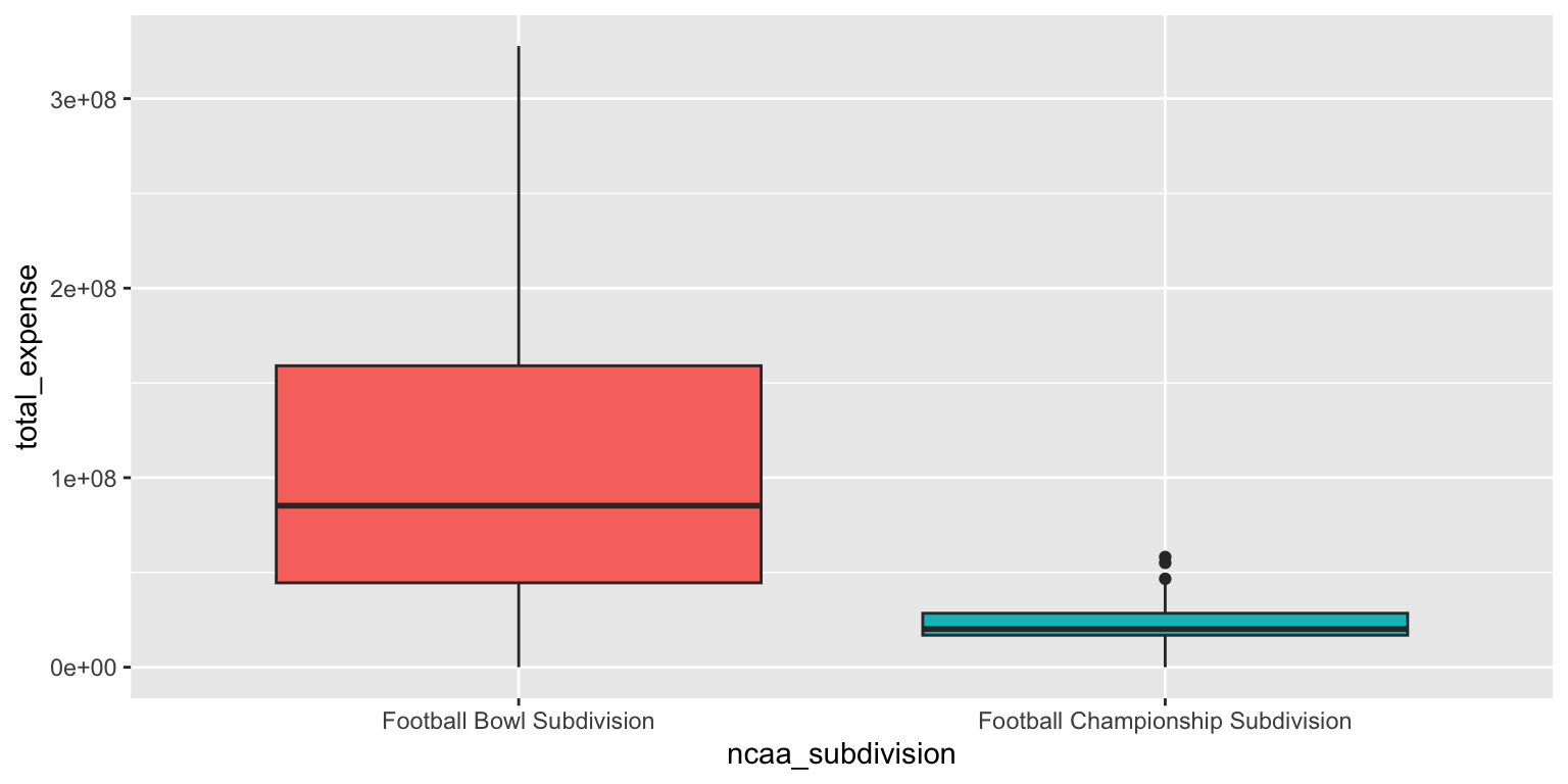
Add response here. The box plots clearly show the differences in the distribution of total expenses between FBS and FCS schools. FBS schools have a higher median expense and a wider interquartile range, indicating more variability in spending compared to FCS schools.
- Use a violin plot. Add color as you see fit and turn off legends if not needed.
# color
ggplot(
  data = ncaa,
  mapping = aes(
    x = ncaa_subdivision,
    y = total_expense,
    fill = ncaa_subdivision
  )
) +
  geom_violin(alpha = 0.5, show.legend = FALSE)
# no color
ggplot(
  data = ncaa,
  mapping = aes(x = ncaa_subdivision, y = total_expense)
) +
  geom_violin()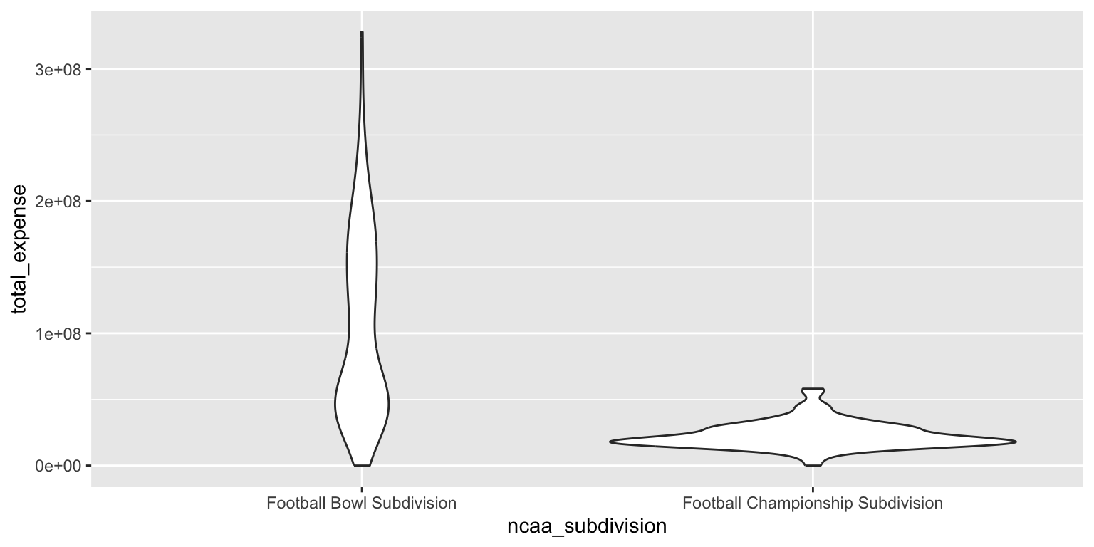
Add response here. The violin plot combines aspects of the box plot and the density plot, providing a more detailed view of the distribution of total expenses for both FBS and FCS schools. It shows the same trends as the box plot, with FBS schools having higher median expenses and greater variability, while also revealing the shape of the distribution. However the density curve for the FBS schools appears much flatter in this graph compared to the density plot, making it harder to discern a meaningful difference across the range of total expenses.
- Make a jittered scatter plot. Add color as you see fit and turn off legends if not needed.
ggplot(
  data = ncaa,
  mapping = aes(
    x = ncaa_subdivision,
    y = total_expense,
    color = ncaa_subdivision
  )
) +
  geom_jitter(show.legend = FALSE)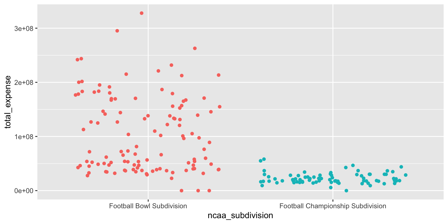
Add response here. The jittered scatter plot displays individual data points for total expenses by subdivision, allowing us to see the spread and density of observations. However any meaningful summary statistics (e.g. median, IQR, mode) are impossible to discern from this plot alone.
- Use beeswarm plots. Add color as you see fit and turn off legends if not needed.
library(ggbeeswarm)

ggplot(
  data = ncaa,
  mapping = aes(
    x = ncaa_subdivision,
    y = total_expense,
    color = ncaa_subdivision
  )
) +
  geom_beeswarm(show.legend = FALSE)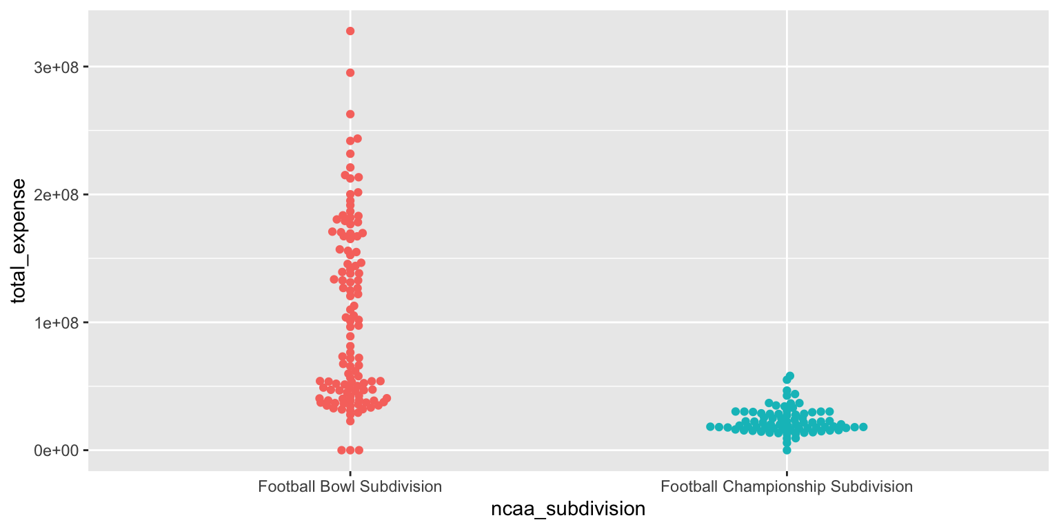
Add response here. The beeswarm plot provides a clear visualization of individual data points for total expenses by subdivision, similar to the jittered scatter plot but with less overlap. It allows us to see the distribution and density of observations while maintaining the integrity of individual data points. However, like the jittered scatter plot, it does not provide summary statistics.
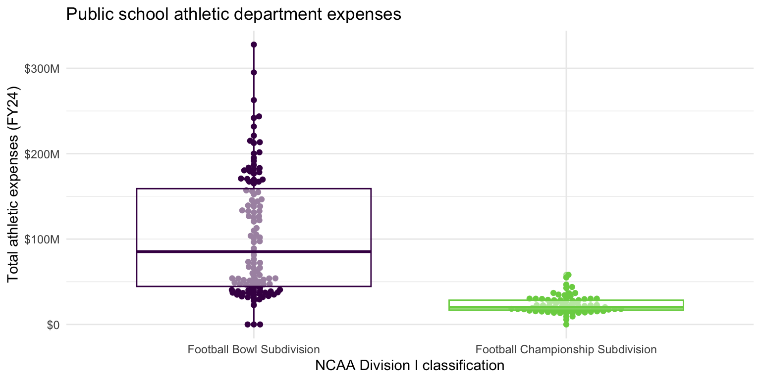
- Demonstration: Use multiple geoms on a single plot. Be deliberate about the order of plotting. Change the theme and the color scale of the plot. Finally, add informative labels.
ggplot(
  data = ncaa,
  mapping = aes(
    x = ncaa_subdivision,
    y = total_expense,
    color = ncaa_subdivision
  )
) +
  geom_beeswarm(show.legend = FALSE) +
  geom_boxplot(show.legend = FALSE, alpha = 0.5) +
  scale_color_viridis_d(option = "D", end = 0.8) +
  scale_y_continuous(labels = label_currency(scale_cut = cut_short_scale())) +
  theme_minimal() +
  labs(
    x = "NCAA Division I classification",
    y = "Total athletic expenses (FY24)",
    title = "Public school athletic department expenses"
  )
Multiple variables - Demo
Analyzing the relationship between three or more variables is called multivariate analysis.
- Facet the plot you created in the previous exercise by
number_of_sports_teams. Adjust labels accordingly.
ggplot(
  data = ncaa,
  mapping = aes(
    x = ncaa_subdivision,
    y = total_expense,
    color = ncaa_subdivision
  )
) +
  geom_beeswarm(show.legend = FALSE) +
  geom_boxplot(show.legend = FALSE, alpha = 0.5) +
  scale_color_viridis_d(option = "D", end = 0.8) +
  scale_y_continuous(labels = label_currency(scale_cut = cut_short_scale())) +
  theme_minimal() +
  labs(
    x = "NCAA Division I classification",
    y = "Total athletic expenses (FY24)",
    title = "Public school athletic department expenses"
  ) +
  facet_wrap(facets = vars(number_of_sports_teams))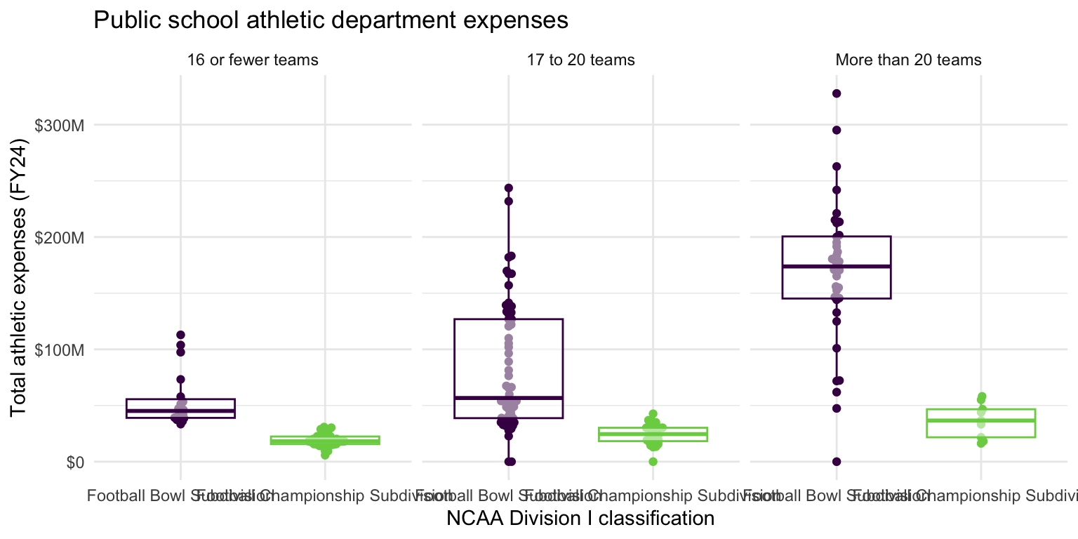
Before you continue, let’s turn off all warnings the code chunks generate and resize all figures. We’ll do this by adding these execute options to the YAML header.
---
execute:
  fig-width: 8
  fig-height: 4
  warning: false
---sessioninfo::session_info()─ Session info ───────────────────────────────────────────────────────────────
setting value
version R version 4.5.2 (2025-10-31)
os macOS Tahoe 26.3.1
system aarch64, darwin20
ui X11
language (EN)
collate en_US.UTF-8
ctype en_US.UTF-8
tz America/New_York
date 2026-03-13
pandoc 3.6.3 @ /Applications/Positron.app/Contents/Resources/app/quarto/bin/tools/aarch64/ (via rmarkdown)
quarto 1.9.33 @ /Applications/quarto/bin/quarto
─ Packages ───────────────────────────────────────────────────────────────────
! package * version date (UTC) lib source
P archive 1.1.12.1 2025-12-24 [?] RSPM
P beeswarm 0.4.0 2021-06-01 [?] RSPM (R 4.5.0)
P bit 4.6.0 2025-03-06 [?] RSPM (R 4.5.0)
P bit64 4.6.0-1 2025-01-16 [?] RSPM (R 4.5.0)
P cli 3.6.5 2025-04-23 [?] RSPM (R 4.5.0)
P crayon 1.5.3 2024-06-20 [?] RSPM (R 4.5.0)
P digest 0.6.39 2025-11-19 [?] RSPM (R 4.5.0)
P dplyr * 1.1.4 2023-11-17 [?] RSPM (R 4.5.0)
P evaluate 1.0.5 2025-08-27 [?] RSPM (R 4.5.0)
P farver 2.1.2 2024-05-13 [?] RSPM (R 4.5.0)
P fastmap 1.2.0 2024-05-15 [?] RSPM (R 4.5.0)
P forcats * 1.0.1 2025-09-25 [?] RSPM (R 4.5.0)
P generics 0.1.4 2025-05-09 [?] RSPM (R 4.5.0)
P ggbeeswarm * 0.7.3 2025-11-29 [?] CRAN (R 4.5.2)
P ggplot2 * 4.0.1 2025-11-14 [?] RSPM (R 4.5.0)
P glue 1.8.0 2024-09-30 [?] RSPM (R 4.5.0)
P gtable 0.3.6 2024-10-25 [?] RSPM (R 4.5.0)
P here 1.0.2 2025-09-15 [?] CRAN (R 4.5.0)
P hms 1.1.4 2025-10-17 [?] RSPM (R 4.5.0)
P htmltools 0.5.9 2025-12-04 [?] RSPM (R 4.5.0)
P htmlwidgets 1.6.4 2023-12-06 [?] RSPM (R 4.5.0)
P jsonlite 2.0.0 2025-03-27 [?] RSPM (R 4.5.0)
P knitr 1.51 2025-12-20 [?] RSPM (R 4.5.0)
P labeling 0.4.3 2023-08-29 [?] RSPM (R 4.5.0)
P lifecycle 1.0.4 2023-11-07 [?] RSPM (R 4.5.0)
P lubridate * 1.9.4 2024-12-08 [?] RSPM (R 4.5.0)
P magrittr 2.0.4 2025-09-12 [?] RSPM (R 4.5.0)
P otel 0.2.0 2025-08-29 [?] RSPM (R 4.5.0)
P pillar 1.11.1 2025-09-17 [?] RSPM (R 4.5.0)
P pkgconfig 2.0.3 2019-09-22 [?] RSPM (R 4.5.0)
P purrr * 1.2.0 2025-11-04 [?] CRAN (R 4.5.0)
P R6 2.6.1 2025-02-15 [?] RSPM (R 4.5.0)
P RColorBrewer 1.1-3 2022-04-03 [?] RSPM (R 4.5.0)
P readr * 2.1.6 2025-11-14 [?] RSPM (R 4.5.0)
renv 1.1.5 2025-07-24 [1] RSPM (R 4.5.0)
P rlang 1.1.6 2025-04-11 [?] RSPM (R 4.5.0)
P rmarkdown 2.30 2025-09-28 [?] RSPM (R 4.5.0)
P rprojroot 2.1.1 2025-08-26 [?] RSPM (R 4.5.0)
P S7 0.2.1 2025-11-14 [?] RSPM (R 4.5.0)
P scales * 1.4.0 2025-04-24 [?] RSPM (R 4.5.0)
P sessioninfo 1.2.3 2025-02-05 [?] RSPM (R 4.5.0)
P stringi 1.8.7 2025-03-27 [?] RSPM (R 4.5.0)
P stringr * 1.6.0 2025-11-04 [?] RSPM (R 4.5.0)
P tibble * 3.3.0 2025-06-08 [?] RSPM (R 4.5.0)
P tidyr * 1.3.2 2025-12-19 [?] RSPM (R 4.5.0)
P tidyselect 1.2.1 2024-03-11 [?] RSPM (R 4.5.0)
P tidyverse * 2.0.0 2023-02-22 [?] RSPM (R 4.5.0)
P timechange 0.3.0 2024-01-18 [?] RSPM (R 4.5.0)
P tzdb 0.5.0 2025-03-15 [?] RSPM (R 4.5.0)
P vctrs 0.6.5 2023-12-01 [?] RSPM (R 4.5.0)
P vipor 0.4.7 2023-12-18 [?] RSPM
P viridisLite 0.4.2 2023-05-02 [?] RSPM (R 4.5.0)
P vroom 1.6.7 2025-11-28 [?] RSPM (R 4.5.0)
P withr 3.0.2 2024-10-28 [?] RSPM (R 4.5.0)
P xfun 0.55 2025-12-16 [?] CRAN (R 4.5.2)
P yaml 2.3.12 2025-12-10 [?] RSPM (R 4.5.0)
[1] /Users/bcs88/Projects/info-2950/course-site/renv/library/macos/R-4.5/aarch64-apple-darwin20
[2] /Users/bcs88/Library/Caches/org.R-project.R/R/renv/sandbox/macos/R-4.5/aarch64-apple-darwin20/4cd76b74
* ── Packages attached to the search path.
P ── Loaded and on-disk path mismatch.
──────────────────────────────────────────────────────────────────────────────Footnotes
The database does not include private universities such as Cornell which are not required to publish their financial data.↩︎